案例 – 实现原神官网中的轮播图
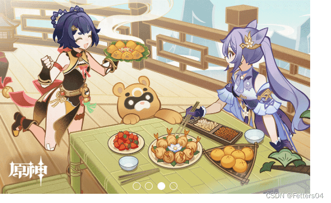
本文中的代码着力实现该图中的效果,一个简单的轮播图:
由于没有使用到 JavaScript 所以最终呈现的效果不够完美
!轮播图的实现参考该 博客 (更详细)

1、基础 html 代码
- 使用
ul-li放入多张需要轮播的图片 - 使用
input标签指定 type=“radio” 创建小圆点按钮,并设置单独的 id 属性 - 使用
label的 for 属性指定到各个 input 按钮的 id - 将各个部分链接到特定的 css 样式中


2、链接 css 样式
完整 css 代码
* {
	margin: 0;
	padding: 0;
}
.carousel_map {
	width: 640px;
	height: 400px;
}
.slide {
	width: inherit;
	height: inherit;
	overflow: hidden;
	position: relative;
}
/* 鼠标放上去显示按钮 */
.slide:hover .labels {
	display: flex;
}
.slide:hover .list {
	animation: none;
}
.slide input {
	display: none;
}
/* 按钮位置 */
.labels {
	position: absolute;
	bottom: 0.5em;
	z-index: 1;
	width: inherit;
	justify-content: center;
	display: none;	/* 鼠标移开隐藏按钮 */
}
/* 按钮样式 */
.labels label {
	width: 1rem;
	height: 1rem;
	border-radius: 50%;
	margin: 0 0.3rem;
	border: 0.1rem solid #fff;
	background-color: transparent;
	box-sizing: border-box;
	cursor: pointer;
}
/* 选择哪个按钮就有被点击的效果 */
input[id=pic1]:checked ~ .labels label[for=pic1],
input[id=pic2]:checked ~ .labels label[for=pic2],
input[id=pic3]:checked ~ .labels label[for=pic3],
input[id=pic4]:checked ~ .labels label[for=pic4] {
	background-color: #fff;
	border: 0.1rem solid #fff;
}
/* 按钮控件选择图片 */
input[id=pic1]:checked ~ .list {
	transform: translate(calc(0 * 640px));
}
input[id=pic2]:checked ~ .list {
	transform: translate(calc(-1 * 640px));
}
input[id=pic3]:checked ~ .list {
	transform: translate(calc(-2 * 640px));
}
input[id=pic4]:checked ~ .list {
	transform: translate(calc(-3 * 640px));
}
ul {
	list-style: none;
}
.list {
	width: calc(5 * 640px);
	height: inherit;
	position: relative;
	/* 设置动画效果 */
	animation: move 15s ease 1s infinite;
}
/* 动画关键帧轮播 */
@keyframes move {
	0% {
		transform: translate(calc(0 * 640px));
	}
	25% {
		transform: translate(calc(-1 * 640px));
	}
	50% {
		transform: translate(calc(-2 * 640px));
	}
	75% {
		transform: translate(calc(-3 * 640px));
	}
	100% {
		transform: translate(calc(-4 * 640px));
	}
}
.item {
	width: 640px;
	height: 400px;
	float: left;
}
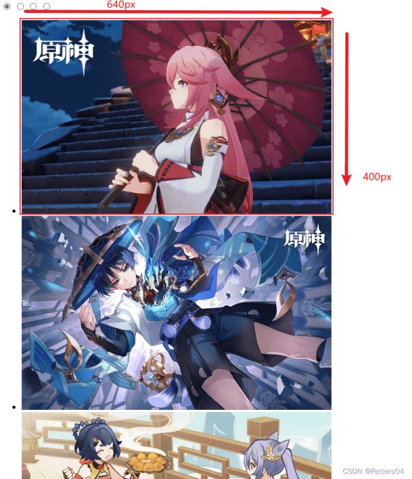
定义轮播图的宽高
在
.carousel_map中定义要展示的轮播图区域的宽高
* {
	margin: 0;
	padding: 0;
}
.carousel_map {
	width: 640px;
	height: 400px;
}
.slide {
	width: inherit;
	height: inherit;
}
图中即为要展示的区域
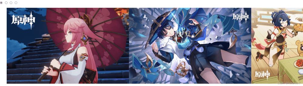
将所有图片排成一排
所有图片左浮动,调整
.list可容纳的宽度,并去掉ul的默认样式
ul {
	list-style: none;
}
.list {
	width: calc(4 * 640px);
	height: inherit;
	position: relative;
}
.item {
	width: 640px;
	height: 400px;
	float: left;
}
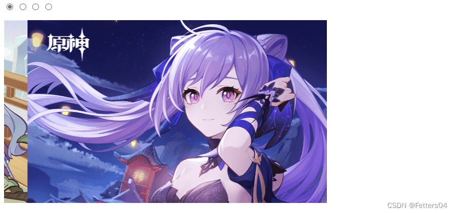
现实无缝切换轮播效果
1)通过动画让
.list水平左移,外部.slide窗口保持不变,将超出.slide的部分隐藏
2)当动画轮播完最后一张图时会跳到图1导致轮播不连贯,所以可以在 html 中多加一张图1在最后
3)再给.list增加一倍的宽度
.slide {
	width: inherit;
	height: inherit;
	/* 新增 */
	overflow: hidden;
	position: relative;
}
.list {
	/* 多加了一张图的宽度 */
	width: calc(5 * 640px);
	height: inherit;
	position: relative;
	/* 设置动画效果 */
	animation: move 15s ease 1s infinite;
}
/* 动画关键帧轮播 */
@keyframes move {
	0% {
		transform: translate(calc(0 * 640px));
	}
	25% {
		transform: translate(calc(-1 * 640px));
	}
	50% {
		transform: translate(calc(-2 * 640px));
	}
	75% {
		transform: translate(calc(-3 * 640px));
	}
	100% {
		transform: translate(calc(-4 * 640px));
	}
}
目前已经出现了轮播效果:
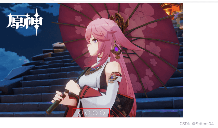
小圆点切换
1)设置鼠标经过轮播图区域时
停止动画
2)在HTML代码中添加单选按钮,通过单选按钮的选中切换图片,又因为单选按钮无法设置样式,所以使用label标签配合生成圆点样式。
3)将单选按钮隐藏,再把制作好的小圆点定位到图片区域,以及添加选中效果。
/* 鼠标经过轮播图区域停止动画 */
.slide:hover .list {
	animation: none;
}
/* 鼠标放上去显示按钮 */
.slide:hover .labels {
	display: flex;
}
/* 将单选按钮隐藏 */
.slide input {
	display: none;
}
/* 制作的小圆点按钮 */
/* 按钮位置 */
.labels {
	position: absolute;
	bottom: 0.5em;
	z-index: 1;
	width: inherit;
	justify-content: center;
	display: none;	/* 鼠标移开隐藏按钮 */
}
/* 按钮样式 */
.labels label {
	width: 1rem;
	height: 1rem;
	border-radius: 50%;
	margin: 0 0.3rem;
	border: 0.1rem solid #fff;
	background-color: transparent;
	box-sizing: border-box;
	cursor: pointer;
}
通过圆点按钮选中图片切换
/* 选择哪个按钮就有被点击的效果 */
input[id=pic1]:checked ~ .labels label[for=pic1],
input[id=pic2]:checked ~ .labels label[for=pic2],
input[id=pic3]:checked ~ .labels label[for=pic3],
input[id=pic4]:checked ~ .labels label[for=pic4] {
	background-color: #fff;
	border: 0.1rem solid #fff;
}
/* 按钮控件选择图片 */
input[id=pic1]:checked ~ .list {
	transform: translate(calc(0 * 640px));
}
input[id=pic2]:checked ~ .list {
	transform: translate(calc(-1 * 640px));
}
input[id=pic3]:checked ~ .list {
	transform: translate(calc(-2 * 640px));
}
input[id=pic4]:checked ~ .list {
	transform: translate(calc(-3 * 640px));
}
如图,即可通过小圆点进行图片间的切换了:
到此这篇关于纯 CSS 实现轮播图效果(自动切换、无缝衔接、小圆点切换)的文章就介绍到这了,更多相关css轮播图内容请搜索IT俱乐部以前的文章或继续浏览下面的相关文章,希望大家以后多多支持IT俱乐部!

