一、mix-blend-mode属性介绍
CSS中的【mix-blend-mode属性】描述了元素的内容应该与元素的直系父元素的内容和元素的背景如何混合;
- 用于设置元素的背景与前景之间的混合模式;
- 可以应用于任何元素;
- 可以与background-image属性一起使用,创建各种不同的视觉效果;
二、mix-blend-mode常用属性值
| 序号 | 属性值 | 混合模式及说明 |
|---|---|---|
| 1 | mix-blend-mode: normal; | 正常:此属性不应用任何混合; |
| 2 | mix-blend-mode: multiply; |
相乘:元素乘以背景并替换背景颜色,生成的颜色始终与背景一样暗; |
| 3 | mix-blend-mode: overlay; |
叠加:根据背景颜色对内容进行倍增或屏蔽,这与硬光混合模式相反; |
| 4 | mix-blend-mode: screen; |
屏幕:将背景和内容相乘,然后补充结果。这将导致内容比背景颜色更亮; |
| 5 | mix-blend-mode: darken; | 变暗;当内容变暗时,背景将被替换为内容,否则将保持原样; |
| 6 | mix-blend-mode: lighten; |
变亮:背景被替换为内容较亮的内容; |
| 7 | mix-blend-mode: color-dodge; | 颜色变淡:此属性使背景颜色变亮,以反映内容的颜色; |
| 8 | mix-blend-mode: color-burn; | 颜色变淡:这会使背景变暗,以反映内容的自然颜色; |
| 9 | mix-blend-mode: hard-light; | 硬光:根据内容的颜色,此属性将对其进行筛选或倍增; |
| 10 | mix-blend-mode: soft-light; | 柔光:根据内容的颜色,这会使其变暗或变亮; |
| 11 | mix-blend-mode: difference; | 差值:这将从最亮的颜色中减去两种颜色中较深的一种; |
| 12 | mix-blend-mode: exclusion; | 排除:与差值相似,但对比度较低; |
| 13 | mix-blend-mode: hue; | 色调:通过内容的色调与背景的饱和度和亮度相结合来创建颜色; |
| 14 | mix-blend-mode: saturation; | 饱和度:通过内容的饱和度和背景的色调和亮度来创建颜色; |
| 15 | mix-blend-mode: color; |
颜色混合:根据内容的色调和饱和度以及背景的亮度创建颜色; |
| 16 | mix-blend-mode: luminosity; | 光度:根据内容的光度和背景的色调和饱和度创建颜色。这与颜色属性相反; |
- normal : this attribute applies no blending whatsoever.
- multiply : the element is multiplied by the background and replaces the background color. The resulting color is always as dark as the background.
- screen : multiplies the background and the content then complements the result. This will result in content which is brighter than the background-color.
- overlay : multiplies or screens the content depending on the background color. This is the inverse of the hard-light blend mode.
- darken : the background is replaced with the content where the content is darker, otherwise, it is left as it was.
- lighten : the background is replaced with the content where the content is lighter.
- color-dodge : this attribute brightens the background color to reflect the color of the content.
- color-burn : this darkens the background to reflect the content’s natural color.
- hard-light : depending on the color of the content this attribute will screen or multiply it.
- soft-light : depending on the color of the content this will darken or lighten it.
- difference : this subtracts the darker of the two colors from the lightest color.
- exclusion : similar to difference but with lower contrast.
- hue : creates a color with the hue of the content combined with the saturation and luminosity of the background.
- saturation : creates a color with the saturation of the content combined with the hue and luminosity of the background.
- color : creates a color with the hue and saturation of the content and the luminosity of the background.
- luminosity : creates a color with the luminosity of the content and the hue and saturation of the background. This is the inverse of the color attribute.
三、mix-blend-mode属性应用
1、应用效果
mix-blend-mode属性的应用
2、相关代码
    mix-blend-mode属性的应用
        * {
            margin: 0;
            padding: 0;
        }
        .container {
            /* 定义变量 */
            --mix-blend-mode: normal;
            position: relative;
            width: 300px;
            height: 400px;
            margin: 60px;
            padding: 20px;
            box-shadow: 0 0 6px 1px #999;
            border-radius: 6px;
            caret-color: transparent;
        }
        h3,
        h4 {
            margin-bottom: 10px;
        }
        .info-box {
            width: 100%;
            height: 24px;
            line-height: 24px;
        }
        .circle {
            position: absolute;
            width: 200px;
            height: 200px;
            border-radius: 50%;
            mix-blend-mode: var(--mix-blend-mode);
        }
        .red-box {
            left: 70px;
            top: 160px;
            background-color: red;
        }
        .green-box {
            left: 30px;
            top: 220px;
            background-color: lightgreen;
        }
        .blue-box {
            left: 110px;
            top: 220px;
            background-color: blue;
        }

        mix-blend-mode属性的应用


    // 获取元素
    var container = document.querySelector(".container");
    var valueBox = document.querySelector(".value-box");
    var infoBox = document.querySelector(".info-box");
    // mix-blend-mode属性的取值列表及说明;
    var values = [
        {
            id: 1,
            name: "正常",
            value: "normal",
            info: "此属性不应用任何混合;"
        },
        {
            id: 2,
            name: "相乘",
            value: "multiply",
            info: "元素乘以背景并替换背景颜色,生成的颜色始终与背景一样暗;"
        },
        {
            id: 3,
            name: "叠加",
            value: "overlay",
            info: "根据背景颜色对内容进行倍增或屏蔽;这与硬光混合模式相反;"
        },
        {
            id: 4,
            name: "屏幕",
            value: "screen",
            info: "将背景和内容相乘,然后补充结果。这将导致内容比背景颜色更亮;"
        },
        {
            id: 5,
            name: "变暗",
            value: "darken",
            info: "当内容变暗时,背景将被替换为内容,否则将保持原样;"
        },
        {
            id: 6,
            name: "变亮",
            value: "lighten",
            info: "背景被替换为内容较亮的内容;"
        },
        {
            id: 7,
            name: "颜色变淡",
            value: "color-dodge",
            info: "此属性使背景颜色变亮,以反映内容的颜色;"
        },
        {
            id: 8,
            name: "颜色变淡",
            value: "color-burn",
            info: "这会使背景变暗,以反映内容的自然颜色;"
        },
        {
            id: 9,
            name: "硬光",
            value: "hard-light",
            info: "根据内容的颜色,此属性将对其进行筛选或倍增。"
        },
        {
            id: 10,
            name: "柔光",
            value: " soft-light",
            info: "根据内容的颜色,这会使其变暗或变亮;"
        },
        {
            id: 11,
            name: "差值",
            value: "difference",
            info: "这将从最亮的颜色中减去两种颜色中较深的一种;"
        }, {
            id: 12,
            name: "排除",
            value: "exclusion",
            info: "与差值相似,但对比度较低;"
        },
        {
            id: 13,
            name: "色调",
            value: "hue",
            info: "通过内容的色调与背景的饱和度和亮度相结合来创建颜色;"
        },
        {
            id: 14,
            name: "饱和度",
            value: "saturation",
            info: "通过内容的饱和度和背景的色调和亮度来创建颜色;"
        },
        {
            id: 15,
            name: "颜色混合",
            value: "color",
            info: "根据内容的色调和饱和度以及背景的亮度创建颜色;"
        },
        {
            id: 16,
            name: "亮度",
            value: "luminosity",
            info: "根据内容的光度和背景的色调和饱和度创建颜色。这与颜色属性相反;"
        }
    ]
    changeMode();
    // 改变mix-blend-mode
    function changeMode() {
        let index = 0;
        modAttr(index);
        let timerId = setInterval(() => {
            if (index >= values.length) {
                clearInterval(timerId);
                return;
            }
            index++;
            modAttr(index)
        }, 3000)
    }
    function modAttr(index) {
        // 设置mix-blend-mode的属性值
        container.style.setProperty('--mix-blend-mode', values[index].value);
        valueBox.innerHTML = `mix-blend-mode : ${values[index].value};`;
        infoBox.innerHTML = `${values[index].name}(${values[index].value}): ${values[index].info}`
    }
四、文字智能适配背景
很多时候,文字需要压着图片显示,如果文字和图片的颜色接近,可读性就会受到严重影响;
如何能让文字自动适配背景?
就可以利用mix-blend-mode属性,设置文字与背景的颜色混合,实现文字适配背景效果;
1、原始样式
文字颜色为白色;在一些图片上的可读性很差;
.grid-item > h3 {
    color: rgb(255, 255, 255);
    ......
}
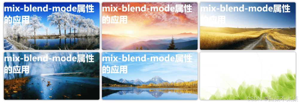

2、添加混合
设置mix-blend-mode属性为difference;
文字颜色的初始值是白色,但会与父元素背景对应的每像素颜色值进行差值计算,得到一个新的颜色值;
文字颜色值 – 背景颜色值 = 混合后的像素值;(每一像素)
例如:文字颜色(255, 255, 255),背景颜色(255, 255, 255),计算后的值(0, 0, 0),显示为黑色;
.grid-item>h3 {
    color: rgb(255, 255, 255);
    /* 设置混合模式 -- 计算差值 */
    mix-blend-mode: difference;
    ......
}
注意:这里的差值混合模式是应用在文字上的;


3、实现代码
    文字智能适配背景
        * {
            margin: 0;
            padding: 0;
        }
        .container {
            display: flex;
            width: 100vw;
            height: 60vh;
            justify-content: center;
            align-items: center;
        }
        .grid-container {
            display: grid;
            grid-template-columns: 400px 400px 400px;
            grid-template-rows: 200px 200px;
            gap: 10px;
        }
        .grid-item {
            background-repeat: no-repeat;
            background-size: cover;
            border-radius: 6px;
            box-shadow: 0 0 6px 1px #999;
        }
        .grid-item>h3 {
            color: rgb(255, 255, 255);
            font-size: 36px;
            /* 设置混合模式 -- 计算差值 */
            mix-blend-mode: difference;
        }
        .grid-item:nth-child(1) {
            /* background-image: url("D:\test\zyl-img\bg_1.jpg"); */
            background-color: red
        }
        .grid-item:nth-child(2) {
            /* background-image: url("D:\test\zyl-img\bg_2.jpg"); */
            background-color: purple;
        }
        .grid-item:nth-child(3) {
            /* background-image: url("D:\test\zyl-img\bg_3.jpg"); */
            background-color: yellow;
        }
        .grid-item:nth-child(4) {
            /* background-image: url("D:\test\zyl-img\bg_4.jpg"); */
            background-color: green;
        }
        .grid-item:nth-child(5) {
            /* background-image: url("D:\test\zyl-img\bg_5.jpg"); */
            background-color: teal;
        }
        .grid-item:nth-child(6) {
            /* background-image: url("D:\test\zyl-img\bg_6.jpg"); */
            background-color: blue;
        }


                mix-blend-mode属性的应用


                mix-blend-mode属性的应用


                mix-blend-mode属性的应用


                mix-blend-mode属性的应用


                mix-blend-mode属性的应用


                mix-blend-mode属性的应用
到此这篇关于CSS中的mix-blend-mode属性详解(设置元素的混合模式)的文章就介绍到这了,更多相关css mix-blend-mode属性内容请搜索IT俱乐部以前的文章或继续浏览下面的相关文章,希望大家以后多多支持IT俱乐部!

