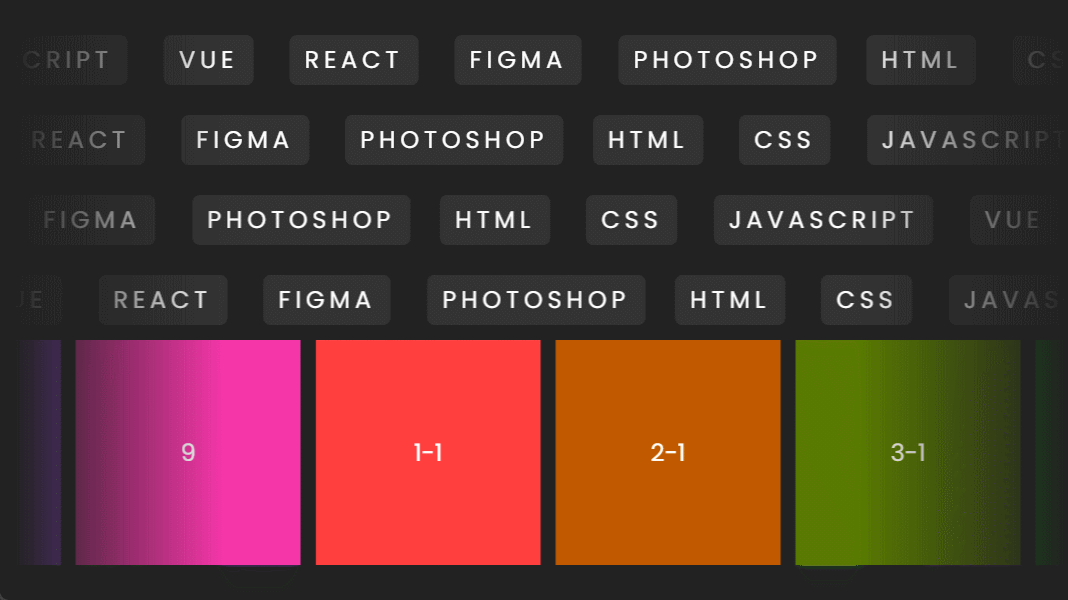
1. 实现效果
gif录屏比较卡,实际很湿滑,因为是css动画实现的
2.html结构
1 2 3 4 5 6 7 8 9 10 11 12 13 14 15 16 17 18 19 20 21 22 23 24 25 26 27 28 29 30 31 32 33 34 35 36 37 38 39 40 41 42 43 44 45 46 47 48 49 50 51 52 53 54 55 56 57 58 59 60 61 62 63 64 65 66 67 68 69 70 71 72 73 74 75 76 77 78 79 80 81 82 83 84 85 86 87 88 89 90 91 92 93 94 95 96 97 98 99 100 101 102 103 104 | <title>Infinite Scrolling Animation</title><div class= "scroll" style= "--t: 20s" > <div> <span>HTML</span> <span>CSS</span> <span>JavaScript</span> <span>Vue</span> <span>React</span> <span>Figma</span> <span>Photoshop</span> </div> <div> <span>HTML</span> <span>CSS</span> <span>JavaScript</span> <span>Vue</span> <span>React</span> <span>Figma</span> <span>Photoshop</span> </div> </div> <div class= "scroll" style= "--t: 30s" > <div> <span>HTML</span> <span>CSS</span> <span>JavaScript</span> <span>Vue</span> <span>React</span> <span>Figma</span> <span>Photoshop</span> </div> <div> <span>HTML</span> <span>CSS</span> <span>JavaScript</span> <span>Vue</span> <span>React</span> <span>Figma</span> <span>Photoshop</span> </div> </div> <div class= "scroll" style= "--t: 10s" > <div> <span>HTML</span> <span>CSS</span> <span>JavaScript</span> <span>Vue</span> <span>React</span> <span>Figma</span> <span>Photoshop</span> </div> <div> <span>HTML</span> <span>CSS</span> <span>JavaScript</span> <span>Vue</span> <span>React</span> <span>Figma</span> <span>Photoshop</span> </div> </div> <div class= "scroll" style= "--t: 35s" > <div> <span>HTML</span> <span>CSS</span> <span>JavaScript</span> <span>Vue</span> <span>React</span> <span>Figma</span> <span>Photoshop</span> </div> <div> <span>HTML</span> <span>CSS</span> <span>JavaScript</span> <span>Vue</span> <span>React</span> <span>Figma</span> <span>Photoshop</span> </div> </div> <div class= "scroll img-box" style= "--t: 25s" > <div> <div class= "bg" style= "--r: 0" > 1 </div> <div class= "bg" style= "--r: 40" > 2 </div> <div class= "bg" style= "--r: 80" > 3 </div> <div class= "bg" style= "--r: 120" > 4 </div> <div class= "bg" style= "--r: 160" > 5 </div> <div class= "bg" style= "--r: 200" > 6 </div> <div class= "bg" style= "--r: 240" > 7 </div> <div class= "bg" style= "--r: 280" > 8 </div> <div class= "bg" style= "--r: 320" > 9 </div> </div> <div> <div class= "bg" style= "--r: 0" > 1 -1 </div> <div class= "bg" style= "--r: 40" > 2 -1 </div> <div class= "bg" style= "--r: 80" > 3 -1 </div> <div class= "bg" style= "--r: 120" > 4 -1 </div> <div class= "bg" style= "--r: 160" > 5 -1 </div> <div class= "bg" style= "--r: 200" > 6 -1 </div> <div class= "bg" style= "--r: 240" > 7 -1 </div> <div class= "bg" style= "--r: 280" > 8 -1 </div> <div class= "bg" style= "--r: 320" > 9 -1 </div> </div> </div> |
3. css代码
1 2 3 4 5 6 7 8 9 10 11 12 13 14 15 16 17 18 19 20 21 22 23 24 25 26 27 28 29 30 31 32 33 34 35 36 37 38 39 40 41 42 43 44 45 46 47 48 49 50 51 52 53 54 55 56 57 58 59 60 61 62 63 64 65 66 67 68 69 70 71 72 73 74 75 76 77 78 79 80 81 82 83 84 85 86 87 88 89 90 91 92 93 94 95 96 97 | * { margin : 0 ; padding : 0 ; box-sizing : border-box ; font-family : 'Poppins' , sans-serif ; } body { min-height : 100 vh; background-color : #222 ; color : #fff ; display : flex ; flex-direction : column; justify-content : center ; align-items : center ; } . scroll { position : relative ; display : flex ; width : 700px ; overflow : hidden ; mask-image : linear-gradient ( 90 deg, transparent , #fff 20% , #fff 80% , transparent ); -webkit- mask-image : linear-gradient ( 90 deg, transparent , #fff 20% , #fff 80% , transparent ); } . scroll > div span { display : inline-block ; margin : 10px ; padding : 5px 10px ; background-color : #333 ; border-radius : 5px ; letter-spacing : 0.2em ; text-transform : uppercase ; cursor : pointer ; transition : background-color 0.5 s; } . scroll > div span:hover { background-color : #4caf50 ; } .img-box { display : flex ; column-gap : 10px ; } .img-box > div, .img-box > div .bg { display : flex ; justify-content : center ; align-items : center ; gap: 10px ; } .img-box .bg { width : 150px ; height : 150px ; background-color : #ff3e3e ; filter : hue- rotate (calc(var(--r) * 1 deg)); cursor : pointer ; transition : filter 0.5 s; } . scroll > div { white-space : nowrap ; animation : animate var(--t) linear infinite ; animation-delay : calc(var(--t) * -1 ); } @keyframes animate { 0% { transform : translateX ( 100% ); } 100% { transform : translateX ( -100% ); } } . scroll > div:nth-child( 2 ) { animation : animate 2 var(--t) linear infinite ; animation-delay : calc(var(--t) / -2 ); } @keyframes animate 2 { 0% { transform : translateX ( 0 ); } 100% { transform : translateX ( -200% ); } } .scroll:hover > div { animation-play-state : paused; } @media screen and ( max-width : 768px ) { . scroll { width : 95 vw; } . scroll > div span { background-color : #4caf50 ; } .img-box .bg { width : 15 vw; height : 15 vw; } } |
到此这篇关于CSS3 实现文本与图片横向无限滚动动画的文章就介绍到这了,更多相关CSS3 横向无限滚动动画内容请搜索IT俱乐部以前的文章或继续浏览下面的相关文章,希望大家以后多多支持IT俱乐部!