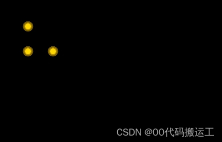
1.效果图,重点opacity,animation,transform:scale
2.html
3.css
 body {
            width: 100%;
            height: 100%;
            background-color: black;
        }
        @keyframes warn {
            0% {
                transform: scale(0);
                opacity: 0.0;
            }
            25% {
                transform: scale(0);
                opacity: 0.1;
            }
            50% {
                transform: scale(0.1);
                opacity: 0.3;
            }
            75% {
                transform: scale(0.2);
                opacity: 0.5;
            }
            100% {
                transform: scale(0.3);
                opacity: 0.0;
            }
        }
        .icon-warnCom {
            position: absolute;
            width: 12px;
            height: 12px;
            background-color: #ffd803;
            border-radius: 100%;
            top: 100px;
            left: 100px;
        }
        .icon-warns {
            position: relative;
            width: 100%;
            height: 100%;
            display: block;
        }
        /* 保持大小不变的小圆圈  */
        .dot {
            position: absolute;
            left: -44px;
            top: -44px;
            width: 60px;
            height: 60px;
            -webkit-border-radius: 100;
            -moz-border-radius: 100;
            border: 20px solid #f6c100;
            border-radius: 100%;
            z-index: 2;
            opacity: 0;
            -webkit-animation: warn 2.5s ease-out;
            -moz-animation: warn 2.5s ease-out;
            animation: warn 2.5s ease-out;
            -webkit-animation-iteration-count: infinite;
            -moz-animation-iteration-count: infinite;
            animation-iteration-count: infinite;
        }
        /* 产生动画(向外扩散变大)的圆圈  */
        .pulse {
            position: absolute;
            left: -44px;
            top: -44px;
            width: 60px;
            height: 60px;
            border: 20px solid #f6c100;
            -webkit-border-radius: 100%;
            -moz-border-radius: 100%;
            border-radius: 100%;
            z-index: 1;
            opacity: 1;
            -webkit-animation: warn 1.5s ease-out;
            -moz-animation: warn 1.5s ease-out;
            animation: warn 1.5s ease-out;
            -webkit-animation-iteration-count: infinite;
            -moz-animation-iteration-count: infinite;
            animation-iteration-count: infinite;
        }
        .icon-warnCom1 {
            position: absolute;
            width: 12px;
            height: 12px;
            background-color: #ffd803;
            border-radius: 100%;
            top: 50px;
            left: 50px;
        }
        .icon-warnCom2 {
            position: absolute;
            width: 12px;
            height: 12px;
            background-color: #ffd803;
            border-radius: 100%;
            top: 100px;
            left: 50px;
        }
到此这篇关于css3实现类似地图定位循环扩散光圈效果的文章就介绍到这了,更多相关css3地图定位循环扩散光圈内容请搜索IT俱乐部以前的文章或继续浏览下面的相关文章,希望大家以后多多支持IT俱乐部!

