css设置背景模糊周边有白色光晕,如何解决?
.img-box {
    width: 100%;
    height: 212px;
    text-align: center;
    position: relative;
    img {
      width: 100%;
      height: 100%;
      position: relative;
      z-index: 5;
    }
    .img-bg {
      position: absolute;
      top: 0;
      left: 0;
      width: 100%;
      height: 100%;
      background-size: 200%; /* 放大两倍 */
      background-position: center;
      background-repeat: no-repeat;
      filter: blur(20px); /* 添加20模糊效果 */
      overflow: hidden;
    }
    .img-bg::before {
      content: "";
      position: absolute;
      top: 0;
      left: 0;
      width: 100%;
      height: 100%;
      background-color: rgba(0, 0, 0, 0.6); /* 60%不透明度的黑色 */
      z-index: 1; /* 确保蒙层在背景之上 */
    }
  }
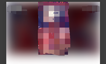
需求:想要给一个展示图片的区域底部加一个该图片的放大后的背景,并模糊 20,并增加一个黑色 0.6 透明度的遮罩
但是按照上面代码实现后,周边有一圈白色光晕,如图:
解决方案:
使用backdrop-filter: blur(20px);
但是注意,backdrop-filter 不能直接加在背景图本身样式上,会导致不生效。
-
backdrop-filter属性需要在具有定位的元素上使用,例如position: relative或position: absolute; -
backdrop-filter应用于的元素需要有一个背景元素在其后,通常是该元素的父级元素。如果没有这样的背景元素,backdrop-filter将不会生效。确保父级元素有可见的背景内容。
所以我们将backdrop-filter 放在 img-bg::before 里,即可生效:
.img-bg::before {
      content: "";
      position: absolute;
      top: 0;
      left: 0;
      width: 100%;
      height: 100%;
      background-color: rgba(0, 0, 0, 0.6); /* 60%不透明度的黑色 */
      z-index: 1; /* 确保蒙层在背景之上 */
      backdrop-filter: blur(20px); /* 添加20模糊效果 */
    }
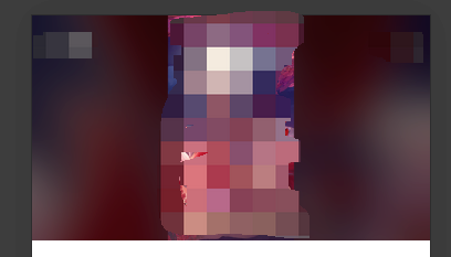
这样就白色光晕的效果了。
到此这篇关于CSS如何设置背景模糊周边有白色光晕的文章就介绍到这了,更多相关css背景模糊内容请搜索IT俱乐部以前的文章或继续浏览下面的相关文章,希望大家以后多多支持IT俱乐部!

