基本原理
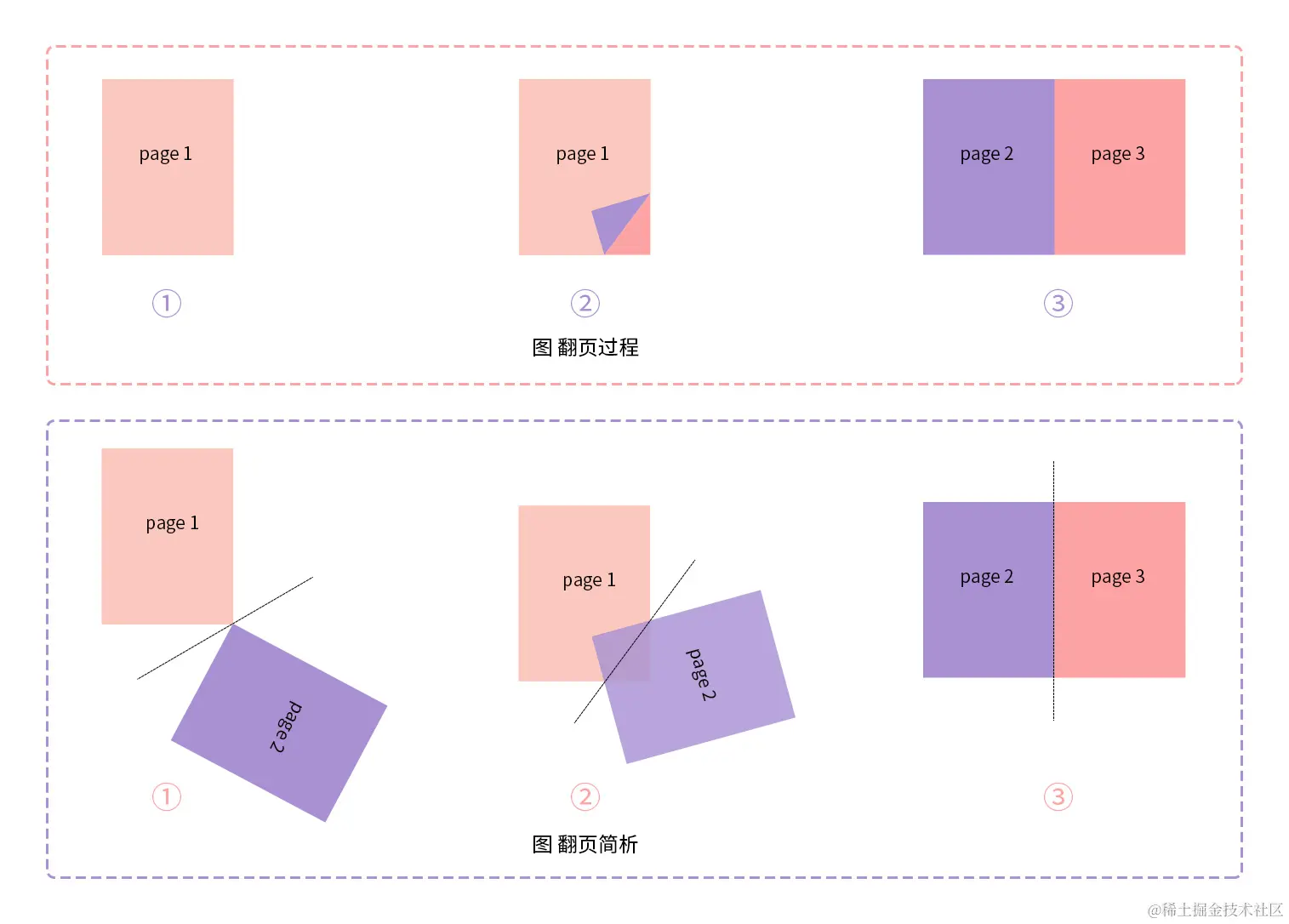
我们先来看一下翻页的过程动图,如下:
观察动图,大致将此翻页过程分为三个状态,书页未翻开、书页翻动中、书页翻动完成,对应的是“图 翻页过程”。可以看出,翻页过程中,第二页是压在第一页上的,随着旋转角度增加,覆盖面积逐渐增大,翻页完成时,第二页完全覆盖第一页,据此画出两页的状态,如图“图 翻页简析”。
到此,可以用代码先把项目的树形结构先写出来
    CSS实现翻页效果
        * {
            margin: 0;
            padding: 0;
        }
        body {
            display: flex;
            min-height: 100vh;
        }
        h1 {
            position: absolute;
            top: 20px;
            left: 0;
            width: 100%;
            font-size: 36px;
            text-align: center;
            margin-top: 100px;
        }
        article {
            position: relative;
            width: 300px;
            height: 400px;
            padding: 40px 80px 40px 380px;
            background-color: bisque;
            margin: auto;
        }
        .book {
            background-color: cornflowerblue;
            position: relative;
        }
        .pageItem {
            position: absolute;
            width: 300px;
            height: 400px;
            font-size: 32px;
            line-height: 400px;
            text-align: center;
            background-color: #fda3a3;
        }
        .front {
            background-color: #fac8bf;
            z-index: 10;
        }
        .back {
            background-color: #a990d2;
            z-index: 10;
        }
    CSS实现翻页效果

            Page 1
            Page 2
            Page 3
代码实现
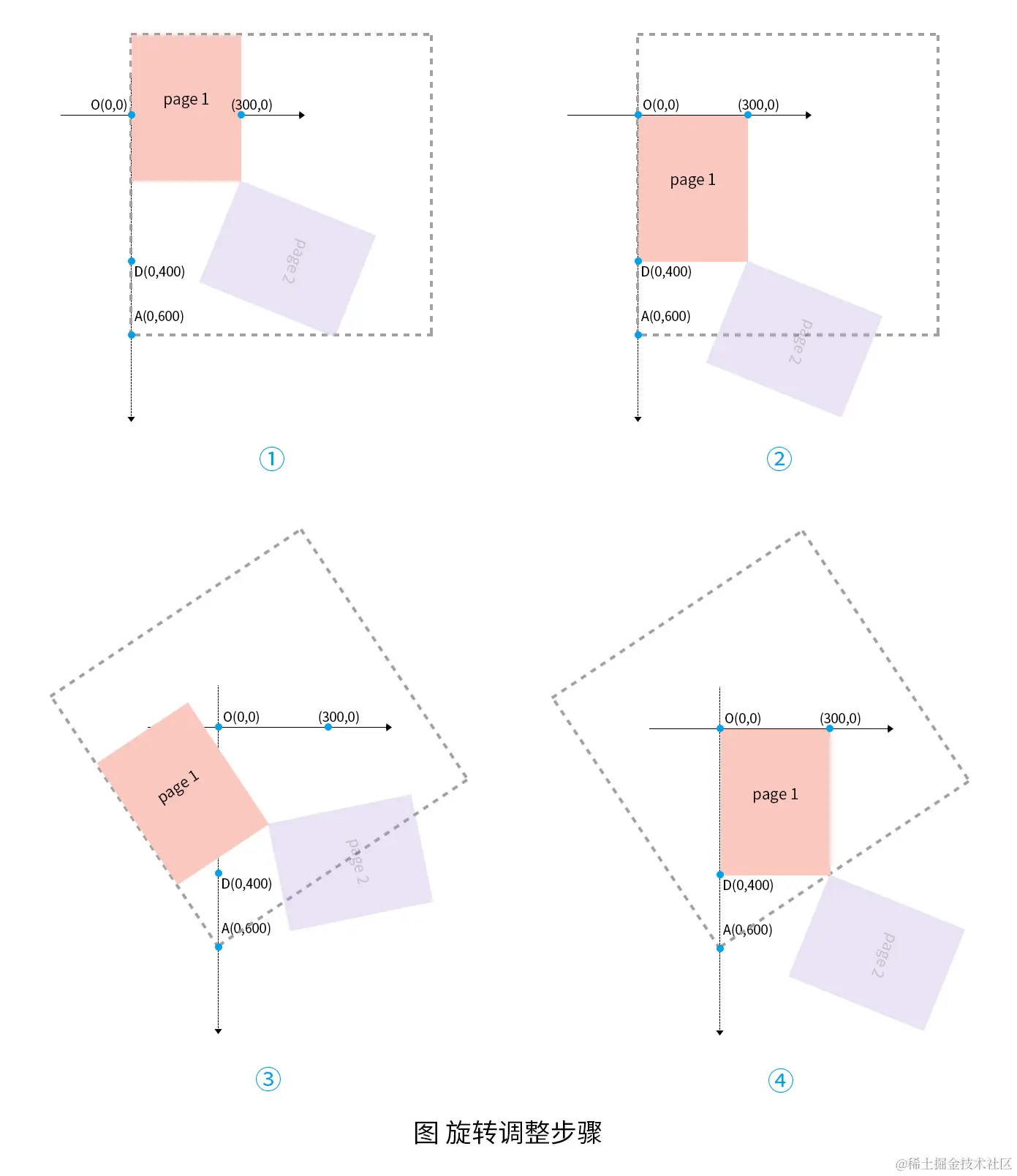
观察“图 翻页简析”得出page2旋转,page1保持不动,即可基本模拟出翻页效果,运用css的动画效果可以实现page2的连续旋转,而动画的初始状态对应的是“图 翻页简析”的①,结束状态则对应③,接下来需要确定的是旋转中心点以及旋转轴,旋转中心点可以是不断变化的,但为了方便,我们取一固定旋转中心点就好,“图 翻页简析”中三条辅助线的相交点大致在左下方,可以确定旋转中心点的位置范围。以代码图形大小为基准,画出对应的坐标系以及旋转中心点,如“图 旋转示意图”:

在上图中,旋转中心点为点A,旋转轴为线AB,另外,初始旋转角度即∠DAB的大小,记∠ACD为角c,∠DAB=2∠DAC=2(90-∠ACD)=180-2c,由tanc=AD/CD,求出c≈33.7,可得∠DAB=112.6。
修改代码,为page2添加旋转动画:
    .back {
        //...
        left: -300px;
        transform-origin:300px 600px;
        transform: rotate(112.6deg);
        transition: 1s;
    }
    article:hover .back{
        transform: rotate(0deg);
    }
考虑到翻页是折角,相当于page1隐藏折角,而page2只显示这一部分折角,page1和page2显示隐藏的划分是线AC,在线AC左边显示,右边隐藏,翻页过程中,线AC也是在旋转的。要实现部分显示功能,css中的overflow:hidden不就可以。想象一下,一个以线AC为边线的盒子套上page1和page2,使得盒子内的内容显示,盒子外则隐藏,那不就能达到我们想要的效果了吗?当然,此父盒子也是要同步旋转的,但是,由于盒子内的元素也会和盒子旋转相同的角度,那我们原定的旋转角度就会因此发生偏移,如下图①:
如上图所示,添加父盒子,设定父盒子的旋转中心点同是点A。偏移的角度即上图③中父盒子的旋转角度,该角和角c为内错角,因此该旋转角度为33.7°。page1和page2只要朝反方向旋转相同的角度就能回复原本位置。编写代码时按照上图步骤一步步进行调整,最终添加父盒子后的代码为:
        .rotateBox {
            position: absolute;
            z-index: 10;
            width: 800px;
            height: 800px;
            bottom: -600px;
            transform-origin: 0px 800px;
            /* border: 4px dashed #b0b0b0; */
            transform: rotate(-33.7deg);
            transition: 1s;
            overflow: hidden;
        }
        .front {
            //...
            //- z-index: 10;
            bottom: 200px;
            transform-origin: 0 600px;
            transform: rotate(33.7deg);
            transition: 1s;
        }
        .back {
            //...
            //- z-index: 10;
            //- transform-origin:300px 600px;
            //- transform: rotate(112.6deg);
            transform-origin: 300px 600px;
            transform: rotate(146.3deg);
            bottom: 200px;
        }
        article:hover .rotateBox {
            transform: rotate(-90deg);
        }
        article:hover .front {
            transform: rotate(90deg);
        }
        article:hover .back {
            //- transform: rotate(0deg);
            transform: rotate(90deg);
        }
页面美化
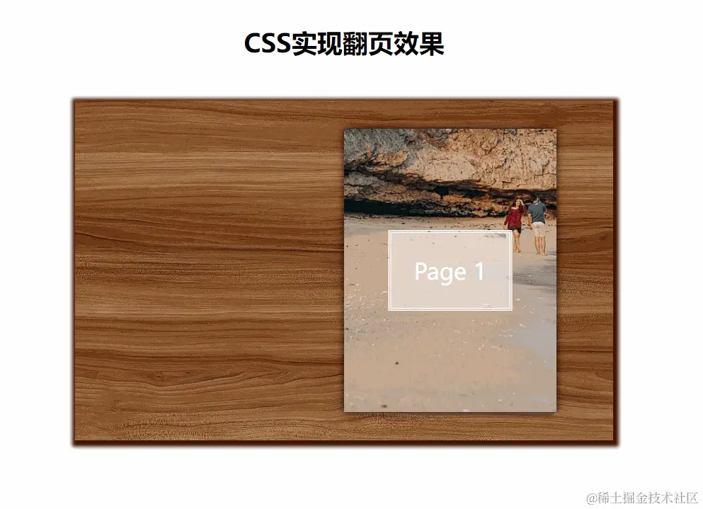
最后,为了使效果更为逼真,添加相应的阴影,替换图片进行美化。
最终代码:
CSS实现翻页效果
* {
margin: 0;
padding: 0;
}
body {
display: flex;
min-height: 100vh;
}
h1 {
position: absolute;
top: 20px;
left: 0;
width: 100%;
font-size: 36px;
text-align: center;
margin-top: 100px;
}
article {
position: relative;
width: 300px;
height: 400px;
padding: 40px 80px 40px 380px;
margin: auto;
box-shadow: 2px 3px 5px 6px #3f1300;
background-image: url(https://cdn.pixabay.com/photo/2016/12/18/09/05/trees-1915245_1280.jpg);
}
.book {
background-color: cornflowerblue;
position: relative;
}
.rotateBox {
position: absolute;
z-index: 10;
width: 800px;
height: 800px;
bottom: -600px;
transform-origin: 0px 800px;
/* border: 4px dashed #b0b0b0; */
transform: rotate(-33.7deg);
transition: 1s;
overflow: hidden;
}
.pageItem {
position: absolute;
width: 300px;
height: 400px;
font-size: 32px;
text-align: center;
box-shadow: 0 0 11px rgba(0, 0, 0, .5);
}
.front {
bottom: 200px;
transform-origin: 0 600px;
transform: rotate(33.7deg);
transition: 1s;
}
.back {
left: -300px;
transform-origin: 300px 600px;
transform: rotate(146.3deg);
transition: 1s;
bottom: 200px;
}
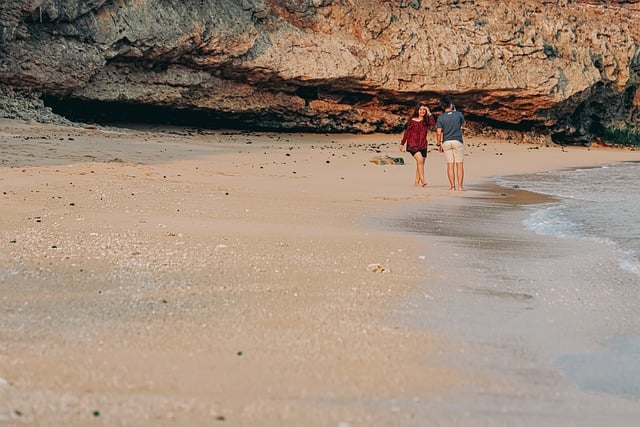
figure img {
width: 100%;
height: 100%;
aspect-ratio: 3/4;
object-fit: cover;
}
figure figcaption {
position: absolute;
top: 50%;
left: 50%;
transform: translate(-50%, -50%);
text-wrap: nowrap;
color: #fff;
background-color: rgba(255, 255, 255, .5);
padding: 1em;
border: 4px double #fff;
}
article:hover .rotateBox {
transform: rotate(-90deg);
}
article:hover .front {
transform: rotate(90deg);
}
article:hover .back {
transform: rotate(90deg);
}
CSS实现翻页效果
Page 1 
Page 2 
Page 3
小小改动
想要让页面初始状态有个小小的折角,只要设置初始角度>33.7°,以45°为例,需要修改上述代码如下:
    .rotateBox {
        //...
        //- transform: rotate(-33.7deg);
        transform: rotate(-45deg);
    }
    .front {
        //...
        //- transform: rotate(33.7deg);
        transform: rotate(45deg);
    }
    .back {
        //...
        //- transform: rotate(146.3deg);
        transform: rotate(135deg);
    }
以上就是使用CSS实现简单的翻页效果的详细内容,更多关于CSS翻页的资料请关注IT俱乐部其它相关文章!

