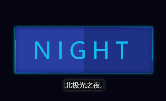
先来看看效果:
制作过程:
1. 定义标签,a标签是按钮,4个span就是按钮周围那四条行动的蓝边。:
2. 定义按钮.night的基本样式:
.night{
            position: relative;
            width: 300px;
            height: 100px;
            color: rgb(18, 190, 243);
            letter-spacing: 12px;
            font-size: 50px;
            line-height: 100px;
            text-align: center;
            /* background-color: rgb(31, 49, 133); */
            background-image: linear-gradient(90deg, rgb(40, 62, 161) 50%,rgb(31, 49, 133) 50% );
            text-transform: uppercase;
            user-select: none;
            text-decoration: none;
            overflow: hidden;
            box-shadow: inset 0 0 10px rgb(14, 20, 105),
            0 0 5px rgb(9, 208, 235);
            transition: all 0.5s;

        }
position : 相对定位。
letter-spacing:字间距。
linear-gradient:渐变颜色。
text-transform:全部字母为大写。
user-select:文本不可选中。
text-decoration:消除默认下划线。
overflow:溢出隐藏。
box-shadow:阴影。
transition:过渡效果。
3. 鼠标经过按钮样式变化:
 .night:hover{
            text-shadow: 0 0 5px rgb(18, 190, 243),
            0 0 8px rgb(18, 190, 243),
            0 0 10px rgb(18, 190, 243);
            background-image: linear-gradient(90deg, rgb(25, 38, 99) 50%,rgb(13, 22, 58) 50% );
            box-shadow: inset 0 0 10px rgb(14, 20, 105),
            0 0 5px rgb(9, 208, 235),
            0 0 10px rgb(9, 208, 235);
        }
text-shadow:文字阴影。
lineear-gradient:渐变色变化。
box-shadow:盒子阴影变化。
4. 4条span的基本样式:
  .night span{
            position: absolute;
        }
absolute 绝对定位
5. 设置按钮上方那条运动蓝线样式:
 .night span:nth-child(1){
            top: 0;
            left: 0;
            width: 100%;
            height: 2px;
            background-image: linear-gradient(to right, transparent , rgb(0, 153, 255) );
            animation: move1 2s linear infinite;
        }
        @keyframes move1 {
            0%{
                transform: translateX(-100%);
            }
            100%{
                transform: translateX(100%);
            }
        }
linear-gradient:渐变色。
transparent为透明色。
animation:设置动画,让蓝线运动起来。
transform: translateX(-100%); 在X轴上的偏移为-100%。
transform: translateX(100%); 让它偏移到100%。
6. 以此类推,其它三条也设置动画,再让左边和右边那条设置动画延迟便可。:
.night span:nth-child(2){
            top: 0;
            right: 0;
            width: 2px;
            height: 100%;
            transform: translateY(-100%);
            background-image: linear-gradient(to bottom,  transparent ,  rgb(0, 153, 255)  );
            animation: move2 2s linear infinite;
            animation-delay: 1s;
        }
        @keyframes move2 {

            100%{
                transform: translateY(100%);
            }
        }
        .night span:nth-child(3){
            left: 0;
            bottom: 0;
            width: 100%;
            height: 2px;
            background-image: linear-gradient(to left, transparent , rgb(0, 153, 255) );
            animation: move3 2s linear infinite;
        }
        @keyframes move3 {
            0%{
                transform: translateX(100%);
            }
            100%{
                transform: translateX(-100%);
            }
        }
        .night span:nth-child(4){
            top: 0;
            left: 0;
            width: 2px;
            height: 100%;
            transform: translateY(100%);
            background-image: linear-gradient(to top, transparent , rgb(0, 153, 255) );
            animation: move4 2s linear infinite;
            animation-delay: 1s;
        }
        @keyframes move4 {
            100%{
                transform: translateY(-100%);
            }
        }
animation-delay: 1s; 设置动画延迟1秒播放。
完整代码:
    Document
        *{
            margin: 0;
            padding: 0;
            box-sizing: border-box;
        }
        body{
            height: 100vh;
            display: flex;
            justify-content: center;
            align-items: center;
            background-color: rgb(4, 4, 19);
        }
        .night{
            position: relative;
            width: 300px;
            height: 100px;
            color: rgb(18, 190, 243);
            letter-spacing: 12px;
            font-size: 50px;
            line-height: 100px;
            text-align: center;
            /* background-color: rgb(31, 49, 133); */
            background-image: linear-gradient(90deg, rgb(40, 62, 161) 50%,rgb(31, 49, 133) 50% );
            text-transform: uppercase;
            user-select: none;
            text-decoration: none;
            overflow: hidden;
            box-shadow: inset 0 0 10px rgb(14, 20, 105),
            0 0 5px rgb(9, 208, 235);
            transition: all 0.5s;

        }
        .night:hover{
            text-shadow: 0 0 5px rgb(18, 190, 243),
            0 0 8px rgb(18, 190, 243),
            0 0 10px rgb(18, 190, 243);
            background-image: linear-gradient(90deg, rgb(25, 38, 99) 50%,rgb(13, 22, 58) 50% );
            box-shadow: inset 0 0 10px rgb(14, 20, 105),
            0 0 5px rgb(9, 208, 235),
            0 0 10px rgb(9, 208, 235);
        }

        .night span{
            position: absolute;
        }
        .night span:nth-child(1){
            top: 0;
            left: 0;
            width: 100%;
            height: 2px;
            background-image: linear-gradient(to right, transparent , rgb(0, 153, 255) );
            animation: move1 2s linear infinite;
        }
        @keyframes move1 {
            0%{
                transform: translateX(-100%);
            }
            100%{
                transform: translateX(100%);
            }
        }
        .night span:nth-child(2){
            top: 0;
            right: 0;
            width: 2px;
            height: 100%;
            transform: translateY(-100%);
            background-image: linear-gradient(to bottom,  transparent ,  rgb(0, 153, 255)  );
            animation: move2 2s linear infinite;
            animation-delay: 1s;
        }
        @keyframes move2 {

            100%{
                transform: translateY(100%);
            }
        }
        .night span:nth-child(3){
            left: 0;
            bottom: 0;
            width: 100%;
            height: 2px;
            background-image: linear-gradient(to left, transparent , rgb(0, 153, 255) );
            animation: move3 2s linear infinite;
        }
        @keyframes move3 {
            0%{
                transform: translateX(100%);
            }
            100%{
                transform: translateX(-100%);
            }
        }
        .night span:nth-child(4){
            top: 0;
            left: 0;
            width: 2px;
            height: 100%;
            transform: translateY(100%);
            background-image: linear-gradient(to top, transparent , rgb(0, 153, 255) );
            animation: move4 2s linear infinite;
            animation-delay: 1s;
        }
        @keyframes move4 {
            100%{
                transform: translateY(-100%);
            }
        }


          night
到此这篇关于使用CSS实现按钮边缘跑马灯动画的文章就介绍到这了,更多相关CSS按钮跑马灯内容请搜索IT俱乐部以前的文章或继续浏览下面的相关文章,希望大家以后多多支持IT俱乐部!

