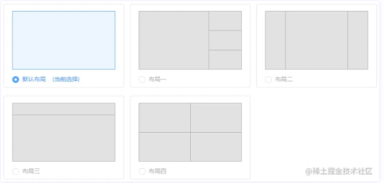
如上图,在日常开发中我们可能会遇到对页面进行不同布局配置的需求,实现方法也有很多,例如:
1.写多个页面,不同布局拥有不同的页面模板与样式代码,这种方法看起来是最麻烦也最没必要的,而且布局一但多起来编码会变得十分难受且冗余难以维护,特别当业务代码基本一致时,修改时也会变得繁琐,修改一种布局中的业务代码也要考虑到其他布局,显然这种方式是极其不推荐的。
2.写一个页面,页面内编写多套模板,通过条件控制实现不同布局风格。这种方法相比方法1的好处是使得业务代码可以在一处地方编写,并且相同的部分也只需编写一次,后期业务代码维护起来也变得更加容易。当然,方法1也可以通过引入外部文件实现同一套业务代码。然而这种方法问题在于模板跟样式都要编写几套,如果能只控制模板或只控制样式就可以实现的话无疑是更佳的方案。方法3将详细介绍通过grid布局方法编写一套模板多种样式实现布局布局风格控制。
3.写一个页面,通过grid布局将页面划分为合适的网格单元,即根据多种布局风格统一起来选择一个合适的行列分割数量。
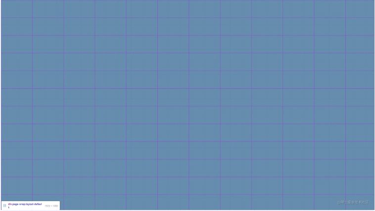
页面模板,按照各种布局中网格数最多的编写(即4个)
将页面划分为12行12列共144个网格单元
css样式中编写不同布局的行列划分原则
.page-wrap {
  //width: 1920px;
  //height: 1080px;
  width: 100%;
  height: 100%;
  display: grid;
  grid-gap: 1px 1px;
  grid-template-columns: repeat(12, 8.333333%);
  grid-template-rows: repeat(12, 8.333333%);
  position: relative;
  background: #FFFFFF;
}
.wrap-layout1,
.wrap-layout2,
.wrap-layout3,
.wrap-layout4 {
  background: #D8D8D8;
}

// 默认布局
.layout-default {
  .wrap-layout1 {
    grid-column: 1 / 13;
    grid-row: 1 / 13;
  }
  .wrap-layout2,
  .wrap-layout3,
  .wrap-layout4 {
    display: none;
  }
}

// 布局一
.layout1 {
  .wrap-layout1 {
    grid-column: 1 / 9;
    grid-row: 1 / 13;
  }
  .wrap-layout2 {
    grid-column: 9 / 13;
    grid-row: 1 / 5;
  }
  .wrap-layout3 {
    grid-column: 9 / 13;
    grid-row: 5 / 9;
  }
  .wrap-layout4 {
    grid-column: 9 / 13;
    grid-row: 9 / 13;
  }
}

// 布局二
.layout2 {
  .wrap-layout1 {
    grid-column: 1 / 3;
    grid-row: 1 / 13;
  }
  .wrap-layout2 {
    grid-column: 3 / 11;
    grid-row: 1 / 13;
  }
  .wrap-layout3 {
    grid-column: 11 / 13;
    grid-row: 1 / 13;
  }
  .wrap-layout4 {
    display: none;
  }
}

// 布局三
.layout3 {
  .wrap-layout1 {
    grid-column: 1 / 13;
    grid-row: 1 / 3;
  }
  .wrap-layout2 {
    grid-column: 1 / 13;
    grid-row: 3 / 13;
  }
  .wrap-layout3 {
    display: none;
  }
  .wrap-layout4 {
    display: none;
  }
}

// 布局四
.layout4 {
  .wrap-layout1 {
    grid-column: 1 / 7;
    grid-row: 1 / 7;
  }
  .wrap-layout2 {
    grid-column: 7 / 13;
    grid-row: 1 / 7;
  }
  .wrap-layout3 {
    grid-column: 1 / 7;
    grid-row: 7 / 13;
  }
  .wrap-layout4 {
    grid-column: 7 / 13;
    grid-row: 7 / 13;
  }
}
到此这篇关于CSS中使用grid布局实现一套模板多种布局的文章就介绍到这了,更多相关css grid布局内容请搜索IT俱乐部以前的文章或继续浏览下面的相关文章,希望大家以后多多支持IT俱乐部!

