单纯用css实现切角+边框+投影+内容背景色渐变所有效果,因为UI没给背景切图,寻思这个理论上用css就能实现。
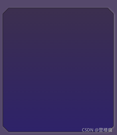
看一下最终要实现的效果:
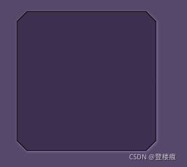
首先不谈内容紫蓝色渐变,一个单纯的四切角+黑色边框+轮廓投影,其实就直接用网上铺天盖地的background:linear-gradient 实现切角+ 套一层小了1px的伪元素实现边框 + filter: box-shadow实现投影就行了,效果和代码如下:
    body {
      background-color: #55486b;
    }
    .box {
      margin: 20px;
      width: 200px;
      height: 200px;
      z-index: 0;
      background: linear-gradient(
            135deg,
            transparent calc(10px + 1 * 0.414px),
            #18121a 0
          )
          top left,
        linear-gradient(
            -135deg,
            transparent calc(10px + 1 * 0.414px),
            #18121a 0
          )
          top right,
        linear-gradient(-45deg, transparent calc(10px + 1 * 0.414px), #18121a 0)
          bottom right,
        linear-gradient(45deg, transparent calc(10px + 1 * 0.414px), #18121a 0)
          bottom left;
      background-size: 55% 50%;
      background-repeat: no-repeat;
      position: relative;
      filter: drop-shadow(1px 1px 2px rgba(255, 255, 255, 0.3));
    }
    .box::after {
      z-index: 1;
      width: calc(100% - 2 * 1px);
      height: calc(100% - 2 * 1px);
      content: "";
      display: block;
      background: linear-gradient(135deg, transparent 10px, #3c2f4f 0) top left,
        linear-gradient(-135deg, transparent 10px, #3c2f4f 0) top right,
        linear-gradient(-45deg, transparent 10px, #3c2f4f 0) bottom right,
        linear-gradient(45deg, transparent 10px, #3c2f4f 0) bottom left;
      background-size: 55% 51%;
      background-repeat: no-repeat;
      position: absolute;
      left: 1px;
      top: 1px;
    }
相当于四个角斜方向用一小段透明色+一大段背景色拼凑起来实现的切角,background-size要大于50%以免有白色线bug。大的div里再套一层小的伪元素实现边框。但由于是四块背景色拼起来的,所以要实现整个内容渐变看起来不可能了。
要实现内容区域也是渐变的,那么换种思路,之间里面那层伪元素background是渐变的,四个切角通过其他属性来切掉,这样就有其他的实现方法了,先来看看:
方法一:mask遮罩
其他东西不变,之前伪元素那块是和外层一样的思路实现切角,这种思路下是无法做到垂直渐变的(因为切角已经是通过斜对角透明色渐变做的),那么直接把背景色写成渐变,通过mask遮罩属性来将四个切角变透明:
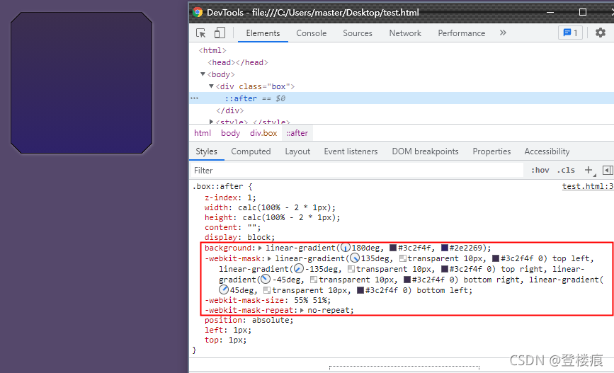
 .box::after {
      z-index: 1;
      width: calc(100% - 2 * 1px);
      height: calc(100% - 2 * 1px);
      content: "";
      display: block;
      background: linear-gradient(180deg, #3c2f4f, #2e2269);
      -webkit-mask: linear-gradient(135deg, transparent 10px, #3c2f4f 0) top
          left,
        linear-gradient(-135deg, transparent 10px, #3c2f4f 0) top right,
        linear-gradient(-45deg, transparent 10px, #3c2f4f 0) bottom right,
        linear-gradient(45deg, transparent 10px, #3c2f4f 0) bottom left;
      -webkit-mask-size: 55% 51%;
      -webkit-mask-repeat: no-repeat;
      position: absolute;
      left: 1px;
      top: 1px;
    }
稍许更改一下上面的代码里伪元素的样式,就实现了。
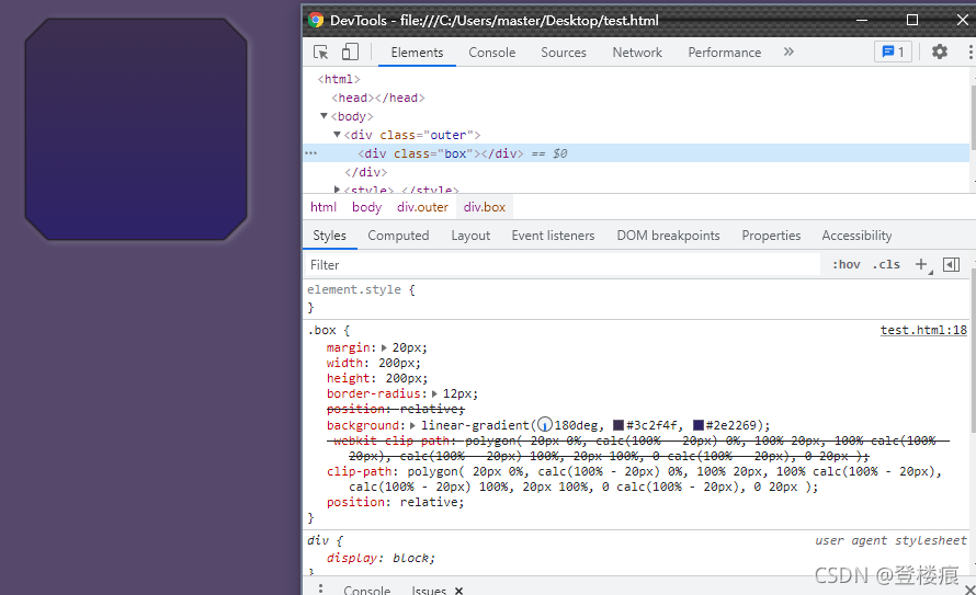
方法二:clip-path
clip-path属性可以直接修剪掉元素周围的边界,如果直接运用在上面伪元素,会发现投影也被遮盖了,那么换个思路,我们索性不要伪元素那一层,直接把div修剪出4个切角。因为filter属性可以叠加,将其父元素添加filter,前n+1个drop-shadow叠加起来形成一个类似黑色边框,最后一个drop-shadow来实现浅白色投影。效果如下:
    body {
      background-color: #55486b;
    }
    .outer {
      filter: drop-shadow(0px 0px 1px #18121a) drop-shadow(0px 0px 1px #18121a)
        drop-shadow(0px 0px 1px #18121a)
        drop-shadow(2px 1px 3px rgba(255, 255, 255, 0.3));
    }
    .box {
      margin: 20px;
      width: 200px;
      height: 200px;
      border-radius: 12px;
      position: relative;

      background: linear-gradient(180deg, #3c2f4f, #2e2269);
      -webkit-clip-path: polygon(
        20px 0%,
        calc(100% - 20px) 0%,
        100% 20px,
        100% calc(100% - 20px),
        calc(100% - 20px) 100%,
        20px 100%,
        0 calc(100% - 20px),
        0 20px
      );
      clip-path: polygon(
        20px 0%,
        calc(100% - 20px) 0%,
        100% 20px,
        100% calc(100% - 20px),
        calc(100% - 20px) 100%,
        20px 100%,
        0 calc(100% - 20px),
        0 20px
      );
      position: relative;
    }
不知道还有没有更简单且兼容性更好的方法~~~~
到此这篇关于CSS实现切角+边框+投影+内容背景色渐变效果的文章就介绍到这了,更多相关css背景色渐变内容请搜索IT俱乐部以前的文章或继续浏览下面的相关文章,希望大家以后多多支持IT俱乐部!

