背景: 前端的设计效果,越来越炫酷,而这些炫酷的效果,利用css3的动画效果和js就可以实现,简单的代码就能实现非常炫酷的效果。原理: 利用 js监控scrollTop的位置,通过 top定位图片的位置,实现视差的滚动;当滚动到目标位置时,通过css3的animation属性,实现抖动效果。
一、预览效果
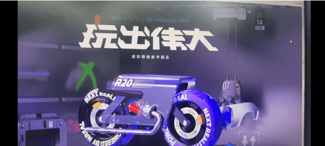
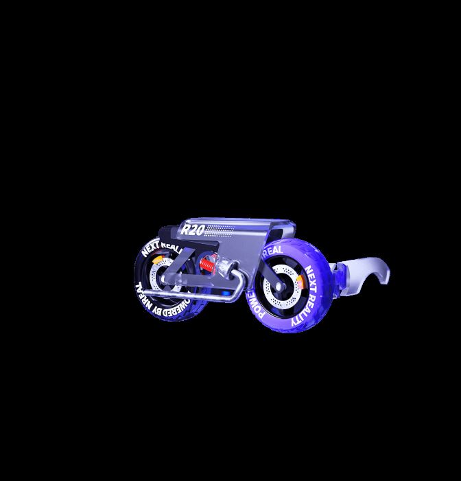
相关素材照片:

二、相关代码
style部分:
    .index-module--nftBox--3H_AP {
        height: 200vh;
        background-repeat: no-repeat;
        background-size: cover;
        background-position: 50%;
        width: 100%;
    }
    .index-module--moto--3sEm1 {
        position: absolute;
        left: 0;
        top: -400px; /*汽车模型初始化位置定点*/
        background-image: url(https://resource.nreal.cn/web/images/home/motuo.png);/*汽车图片*/
        transition: .5s;
        -webkit-transform: translate(0);
        transform: translate(0);
    }
    .index-module--moto--3sEm1.is-active{ /*汽车模型的抖动效果*/
        animation: jump .1s ease-in-out 5 alternate;
    }
    @keyframes jump {/*汽车模型的抖动效果*/
        from { top: -30px; }
        to { top: 6px }
    }
    .index-module--moto--3sEm1, .index-module--nftBox--3H_AP {
        height: 200vh;
        background-repeat: no-repeat;
        background-size: cover;
        background-position: 50%;
        width: 100%;
    }
    .index-module--title--rSrVs {
        opacity: 1;
        width: 80%;
        margin: 0 auto;
    }
    .index-module--titleBox--1VS2L {
        height: 50vh;
        display: flex;
        justify-content: center;
        align-items: center;
        position: absolute;
        top: 0;
        left: 50%;
        -webkit-transform: translate(-50%);
        transform: translate(-50%);
    }
    .hoZaHW {
        animation-name: ewofWB;
        animation-duration: 300ms;
        animation-iteration-count: infinite;
        transform-origin: center center;
        animation-play-state: running;
    }
    /* @keyframes ewofWB {
        0%   { left:0px; top:0px;}
    25%  { left:200px; top:0px;}
    50%  { left:200px; top:200px;}
    75%  { left:0px; top:200px;}
    100% { left:0px; top:0px;}
    } */
    .index-module--nftTitle--20OyY {
        width: 100%;
        max-width: 800px;
    }
    .index-module--duang--5jpDr {
        -webkit-animation: index-module--circleP--3P-V7 1.3s;
        animation: index-module--circleP--3P-V7 1.3s;
        -webkit-transform: translateY(400px);
        transform: translateY(400px);
    }
    .index-module--moto--3sEm1 {
        position: absolute;
        left: 0;
        -webkit-transform: translate(0);
        transform: translate(0);
    }
html部分:

js部分:
    window.onscroll= function(){
            //变量t是滚动条滚动时,距离顶部的距离
            var t = document.documentElement.scrollTop||document.body.scrollTop;
            var scrollup = document.getElementById('scrollup');
            //当滚动到距离顶部200px时
            if(t>=200){             scrollup.style.backgroundImage="url(https://resource.nreal.cn/web/images/home/motuo.png)";
                scrollup.style.top=6+"px";
                if(scrollup.style.top == '6px'){
                   document.getElementById("scrollup").classList.add("is-active")
                }
            }else{//恢复正常               scrollup.style.backgroundImage="url(https://resource.nreal.cn/web/images/home/motuo.png)";
                scrollup.style.top=-400+"px";
                document.getElementById("scrollup").classList.remove("is-active")
            }
    }
到此这篇关于利用CSS实现视差滚动和抖动效果的文章就介绍到这了,更多相关css视差滚动内容请搜索IT俱乐部以前的文章或继续浏览下面的相关文章,希望大家以后多多支持IT俱乐部!

