在之前,我们有些过这么一篇文章 – 使用 CSS 轻松实现高频出现的各类奇形怪状按钮。
里面包含了如下这些图形:
你可以在这里看到:CodePen Demo — CSS Various Button Shapes | CSS 各种造型按钮
接下来几篇文章中,将在上述基础上,额外补充一些在日常设计稿中,常见的,可能出现的更为复杂的几个按钮,本文,我们来尝试实现这个造型:
不镂空的内凹圆角按钮
在文章开头的贴图中,其实是有和这个按钮非常类似的造型:
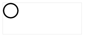
此造型如果内部无需镂空,整体还是比较简单的,利用 background: radial-gradient() 径向渐变或者 mask,都能比较轻松的实现。
我们快速回顾一下,看这样一个简单的例子:
div {
    background-image: radial-gradient(circle at 100% 100%, transparent 0, transparent 12px, #2179f5 12px);
}
可以得到这样一个图形:

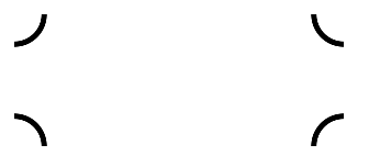
所以,只需控制下 background-size,在 4 个角实现 4 个这样的图形即可:
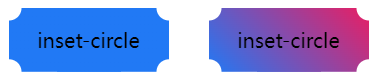
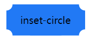
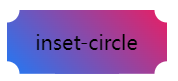
inset-circle
&.inset-circle {
    background-size: 70% 70%;
    background-image: radial-gradient(
            circle at 100% 100%,
            transparent 0,
            transparent 12px,
            #2179f5 13px
        ),
        radial-gradient(
            circle at 0 0,
            transparent 0,
            transparent 12px,
            #2179f5 13px
        ),
        radial-gradient(
            circle at 100% 0,
            transparent 0,
            transparent 12px,
            #2179f5 13px
        ),
        radial-gradient(
            circle at 0 100%,
            transparent 0,
            transparent 12px,
            #2179f5 13px
        );
    background-repeat: no-repeat;
    background-position: right bottom, left top, right top, left bottom;
}
借助 mask 实现渐变的内切圆角按钮
如果背景色要求渐变怎么办呢?
假设我们有一张矩形背景图案,我们只需要使用 mask 实现一层遮罩,利用 mask 的特性,把 4 个角给遮住即可。
mask 的代码和上述的圆角切角代码非常类似,简单改造下即可得到渐变的内切圆角按钮:
inset-circle
.mask-inset-circle {
    background: linear-gradient(45deg, #2179f5, #e91e63);
    mask: radial-gradient(
            circle at 100% 100%,
            transparent 0,
            transparent 12px,
            #2179f5 13px
        ),
        radial-gradient(
            circle at 0 0,
            transparent 0,
            transparent 12px,
            #2179f5 13px
        ),
        radial-gradient(
            circle at 100% 0,
            transparent 0,
            transparent 12px,
            #2179f5 13px
        ),
        radial-gradient(
            circle at 0 100%,
            transparent 0,
            transparent 12px,
            #2179f5 13px
        );
    mask-repeat: no-repeat;
    mask-position: right bottom, left top, right top, left bottom;
    mask-size: 70% 70%;
}
这样,我们就得到了这样一个图形:
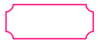
镂空的内凹圆角边框
但是,如果要求内部是整体镂空,只展示内凹圆角边框,整个复杂度一下就上来了。
上面的方法以及不适用了,原因在于很难利用 mask 制造一个不规则的内凹圆角形状进行裁剪,因此,我们必须另辟蹊径。
渐变偏移技巧
在 CSS 高阶小技巧 – 角向渐变的妙用! 一文中,我们介绍了渐变一个非常有意思的偏移技巧:
举个例子,下面是角向渐变 conic-gradient() 的简单介绍:
{
    background: conic-gradient(deeppink, yellowgreen);
}
从渐变的圆心、渐变起始角度以及渐变方向上来说,是这样的:
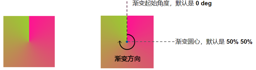
划重点:
从图中可以看到,角向渐变的起始圆心点、起始角度和渐变方向为:
- 起始点是图形中心,
- 默认渐变角度 0deg 是从上方垂直于圆心的
- 渐变方向以顺时针方向绕中心实现
当然,我们也可以控制角向渐变的起始角度以及角向渐变的圆心。
稍微改一下上述代码:
{
    background: conic-gradient(from 270deg at 50px 50px, deeppink, yellowgreen);
}
效果如下:
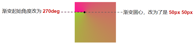
我们改变了起始角度以及角向渐变的圆心:
了解了这个之后。我们基于上述的图形,重新绘制一个图形:
div {
    margin: auto;
    width: 200px;
    height: 200px;
    background: conic-gradient(from 270deg at 50px 50px, deeppink 0%, deeppink 90deg, transparent 90deg, transparent
 360deg);
    border: 1px solid #000;
}
效果如下:
起始角度以及角向渐变的圆心没有改变,但是只让前 90deg 的图形为粉色,而后 270deg 的图形,设置为了透明色。
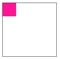
我们利用角向渐变,在图像内部,又实现了一个小的矩形!
接下来,我们再给上述图形,增加一个 background-position: -25px, -25px:
div {
    margin: auto;
    width: 200px;
    height: 200px;
    background: conic-gradient(from 270deg at 50px 50px, deeppink 0%, deeppink 90deg, transparent 90deg, transparent
 360deg);
    background-position: -25px -25px;
    border: 1px solid #000;
}
这样,我们就神奇的得到了这样一个图形:
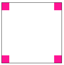
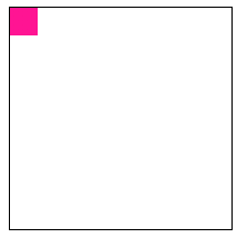
为什么会有这样一种现象?如果我们在代码中加入 background-repeat: no-repeat:
div {
    width: 200px;
    height: 200px;
    background: conic-gradient(from 270deg at 50px 50px, deeppink 0%, deeppink 90deg, transparent 90deg, transparent
 360deg);
    background-position: -25px -25px;
    background-repeat: no-repeat;
    border: 1px solid #000;
}
那么就只会剩下左上角一个角:
因此,这里实际上利用了渐变图形默认会 repeat 的特性,实际上是这么个意思:
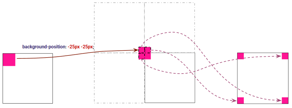
理解了这张图,也就理解了整个技巧的核心所在!
利用径向渐变实现圆环偏移
掌握了上述渐变的偏移技巧后,我们将上述的角向渐变的案例,移植到径向渐变。
首先,我们利用径向渐变,实现一个小圆环:
div {
    width: 300px;
    height: 120px;
    border: 1px solid #ddd;
    background: radial-gradient(30px at 30px 30px, transparent calc(98% - 5px),#000 calc(100% - 5px) 98%, transparent);
}
解释一下,上述渐变语句的含义是在 30px 30px 处,实现一个半径为 30px 的径向渐变,渐变颜色为透明到黑色到透明,因此可以得到一个圆环:
为了方便大家看清楚 div 整体大小,利用 border: 1px solid #ddd 展示了整个 div 的轮廓,下图开始隐藏 border
然后,利用上述的技巧,我们让渐变图形,整体偏移 -30px -30px,也就是让径向渐变图形的圆心,处于div的左上角 0 0 坐标处。
div {
    width: 300px;
    height: 120px;
    border: 1px solid #ddd;
    background: radial-gradient(30px at 30px 30px, transparent calc(98% - 5px),#000 calc(100% - 5px) 98%, transparent);
    background-position: -30px -30px;
}
此时,图形就变成了这样(下图去掉了 border):
到这,大家应该能恍然大悟了吧。剩下的工作就比较简单了,我们只需要利用多重线性渐变,把剩余的线条补充出来即可,整个图形完整的代码如下:
div {
    width: 300px;
    height: 120px;
    background:
        radial-gradient(30px at 30px 30px, transparent calc(98% - 5px),#ff2287 calc(100% - 5px) 98%, transparent),
        linear-gradient(#ff2287, #ff2287),
        linear-gradient(#ff2287, #ff2287),
        linear-gradient(#ff2287, #ff2287),
        linear-gradient(#ff2287, #ff2287);
    background-position:
        -30px -30px,
        29px 0, 29px 100%, // 两条横边
        0 29px, 100% 29px; // 两条纵边
    background-size:
        100% 100%,
        calc(100% - 58px) 5px, calc(100% - 58px) 5px,
        5px calc(100% - 58px), 5px calc(100% - 58px);
    background-repeat:
        repeat,
        no-repeat, no-repeat,
        no-repeat, no-repeat;
}
这样,我们就成功得到了我们想要的不镂空的内凹圆角边框:

当然,我们肯定是需要不同边框大小、颜色的各种不镂空的内凹圆角边框,我们利用 CSS 变量再进行一下封装:
.g-custom {
    background:
        radial-gradient(var(--border_radius) at var(--border_radius) var(--border_radius), transparent calc(97% - var(--border_width)),var(--color) calc(100% - var(--border_width)) 98%, transparent),
        linear-gradient(var(--color), var(--color)),
        linear-gradient(var(--color), var(--color)),
        linear-gradient(var(--color), var(--color)),
        linear-gradient(var(--color), var(--color));
    background-position:
        calc(-1 * var(--border_radius)) calc(-1 * var(--border_radius)),
        calc(var(--border_radius) - 1px) 0, calc(var(--border_radius) - 1px) 100%, // 两条横边
        0 calc(var(--border_radius) - 1px), 100% calc(var(--border_radius) - 1px); // 两条纵边
    background-size:
        100% 100%,
        calc(100% - calc(var(--border_radius) * 2 - 2px)) var(--border_width), calc(100% - calc(var(--border_radius) * 2 - 2px)) var(--border_width),
        var(--border_width) calc(100% - calc(var(--border_radius) * 2 - 2px)), var(--border_width) calc(100% - calc(var(--border_radius) * 2 - 2px));
    background-repeat:
        repeat,
        no-repeat, no-repeat,
        no-repeat, no-repeat;
}
.g-custom-1 {
    width: 200px;
    height: 120px;
    --color: #6678ff;
    --border_radius: 15px;
    --border_width: 1px;
}
.g-custom-2 {
    width: 240px;
    height: 160px;
    --color: #448800;
    --border_radius: 35px;
    --border_width: 3px;
}
.g-custom-3 {
    width: 180px;
    height: 180px;
    --color: #df73a0;
    --border_radius: 40px;
    --border_width: 6px;
}
这样,控制三个 CSS 变量,就可以得到各种不同样式的边框了:
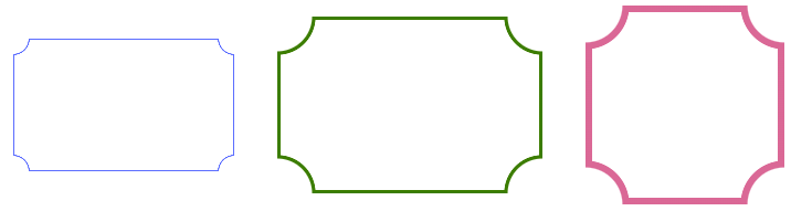
完整的代码,你可以戳这里:CodePen Demo — 内凹角边框 & inner-corner-border
怎么样,一个非常有技巧性的 CSS 图形,你 Get 到了吗?
最后
好了,本文到此结束,希望本文对你有所帮助 😃
想 Get 到最有意思的 CSS 资讯,千万不要错过我的公众号 — iCSS前端趣闻 😄
更多精彩 CSS 技术文章汇总在我的 Github — iCSS ,持续更新,欢迎点个 star 订阅收藏。
到此这篇关于巧用 CSS 实现高频出现的复杂怪状按钮之镂空的内凹圆角边框的文章就介绍到这了,更多相关css镂空的内凹圆角边框内容请搜索IT俱乐部以前的文章或继续浏览下面的相关文章,希望大家以后多多支持IT俱乐部!

