前几天看了国外一个大佬用HTML+CSS实现HamburgerMenu的视频,然后最近在看Sass,所以用Sass来实现一下。
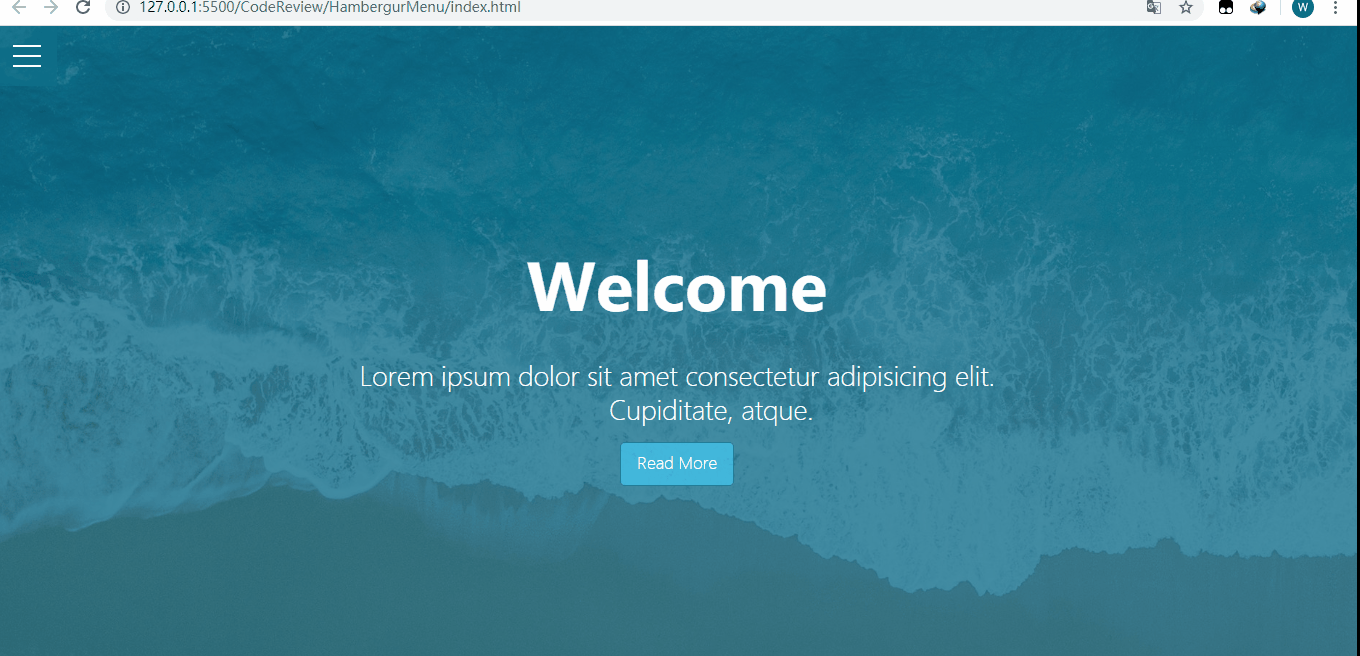
最终效果图如下:
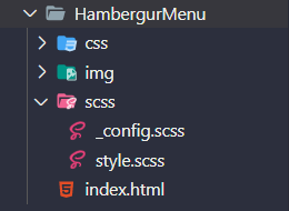
在VS Code中的文件结构(编译scss文件用的是easy sass):
页面结构(index.html):
_config.scss:
/*设置颜色及max-width*/
$primary-color: rgba(13,110,139,.75);
$overlay-color: rgba(24,39,51,.85);
$max-width: 980px;

/*设置文本颜色,如果背景色浅,则设置为黑色,否则设置为白色*/
@function set-text-color($color){
  @if(lightness($color)>70){
    @return #333;
  }@else{
    @return #fff;
  }
}

/*混合器,设置背景色及文本颜色*/
@mixin set-background($color){
  background-color: $color;
  color: set-text-color($color);
}
style.scss:
@import '_config';
*{
  margin: 0;
  padding: 0;
}

.container{
  max-width: $max-width;
  margin: 0 auto;
}

/*给showcase设置背景颜色,利用伪类再添加一个背景图,同时将背景图的z-index设置为-1(这样图片会显示在里面);
然后为了让文字显示在中间,所以使用flex布局*/
.showcase{
  position: relative;
  height: 100vh;
  background-color: $primary-color;
  &:before{
    content: '';
    position: absolute;
    left: 0;
    top: 0;
    width: 100%;
    height: 100%;
    background: url('../img/pexels-photo-533923.jpeg') no-repeat center center / cover;
    z-index: -1;
  }
  &-inner{
    display: flex;
    height: 100%;
    flex-direction: column;
    justify-content: center;
    align-items: center;
    text-align: center;
    color: #fff;
    font-weight: 100;
    h1{
      font-size: 4rem;
      padding: 1.2rem 0;
    }
    p{
      white-space: pre-wrap;
      font-size: 1.6rem;
      padding: 0.85rem 0;
    }
    .btn{
      padding: .65rem 1rem;
        /*使用混合器设置背景色及文本颜色*/
      @include set-background(lighten($primary-color,30%));
      border: none;
      border: 1px solid $primary-color;
      border-radius: 5px;
      text-decoration: none;
      outline: none;
      transition: all .2s ease .1s;
        /*按钮hover的时候利用css3的scale设置一个缩放效果*/
      &:hover{
        @include set-background(lighten($overlay-color,30%));
        border-color: lighten($overlay-color, 25%);
        transform: scale(.98);
      }
    }
  }
}

/*原理:通过checkbox的点中与否来进行样式的变化(将checkbox透明度设置为0,z-index设置更高),单击时,会出现菜单,再次点击,菜单消失*/
/*给menu-wrap设置fixed,这样showcase就会占满整个屏幕;同时将checkbox的opacity设置为0;
另外注意,需要将checkbox的z-index设置为2,因为hamburger的z-index设置为1,不然会点击不起作用
*/
.menu-wrap{
  position: fixed;
  left: 0;
  top: 0;
  z-index: 1;
  .toggle{
    position: absolute;
    left: 0;
    top: 0;
    width: 50px;
    height: 50px;
    opacity: 0;
    z-index: 2;
    cursor: pointer;
      /*当checkbox为checked时,设置hamburger里面的div及伪类的旋转效果*/
    &:checked ~ .hamburger>div{
      transform: rotate(135deg);
        /*伪类实际上旋转了225度,需要将top设置为0,不然形成的❌长短不一致*/
      &:before,&:after{
        transform: rotate(90deg);
        top: 0;
      }
    }

      /*当checkbox选中时再hover,也会设置一个旋转效果*/
    &:checked:hover ~ .hamburger>div{
      transform: rotate(235deg);
    }
    &:checked ~ .menu{
      visibility: visible;
      >div{
        transform: scale(1);
        >div{
          opacity: 1;
        }
      }
    }
  }

  .hamburger{
    position: absolute;
    left: 0;
    top: 0;
    width: 60px;
    height: 60px;
    padding: 1rem;
    background-color: $primary-color;
    box-sizing: border-box;
    display: flex;
    flex-direction: column;
    justify-content: center;
    align-items: center;
    text-align: center;
    z-index: 1;
      /*div自身生成中间的横线,然后设置定位为relative,后面再将其伪类设置为absolute,
      相对于div进行偏移*/
    >div{
      position: relative;
      left: 0;
      top: 0;
      width: 100%;
      height: 2px;
      background-color: #fff;
      transition: all .7s ease;
        /*利用伪类生成第一条和第三条横线*/
      &:before,
      &:after{
        content: '';
        position: absolute;
        left: 0;
        top: -10px;
        width: 100%;
        height: 2px;
        background-color: inherit;
      }
      &:after{
        top: 10px;
      }
    }
  }

    /*设置选中后的菜单的样式*/
    /*将menu设置为fixed,同时宽高为100%,然后设置display为flex,否则菜单不会出现在中间*/
  .menu{
    position: fixed;
    left: 0;
    top: 0;
    width: 100%;
    height: 100%;
    overflow: hidden;
    display: flex;
    justify-content: center;
    align-items: center;
    visibility: hidden;    /*将菜单设置为不可见,然后在checkbox选中时设置为可见*/
    transition: all .75s ease;
    >div{
      @include set-background($overlay-color);
      width: 200vw;
      height: 200vh;
      overflow: hidden;
      border-radius: 50%;
      display: flex;
      justify-content: center;
      align-items: center;
      text-align: center;
      transform: scale(0);
      transition: all .4s ease;
      >div{
        max-width: 90vw;
        max-height: 90vh;
        opacity: 0;
        transition: all .4s ease;
        >ul>li{
          list-style: none;
          font-size: 2rem;
          padding: .85rem 0;
          text-transform: uppercase;
          transform: skew(-5deg,-5deg) rotate(5deg);/*设置文字倾斜*/
          a{
            color: inherit;
            text-decoration: none;
            transition: color .4s ease;
          }
        }
      }
    }
  }
}
到此这篇关于HTML+Sass实现HambergurMenu(汉堡包式菜单)的文章就介绍到这了,更多相关HTML+Sass实现HambergurMenu内容请搜索IT俱乐部以前的文章或继续浏览下面的相关文章,希望大家以后多多支持IT俱乐部!

