先上效果图下面附上代码
1 2 3 4 5 6 7 8 9 10 11 12 13 14 15 16 17 18 19 20 21 22 23 24 25 26 27 28 29 30 31 32 33 34 35 36 37 38 39 40 41 42 43 44 45 46 47 48 49 50 51 52 53 54 55 56 57 58 59 60 61 62 63 64 65 66 67 68 69 70 71 72 73 74 75 76 77 78 79 80 81 82 83 84 85 86 87 88 89 90 91 92 93 94 95 96 97 98 99 100 101 102 103 104 105 106 107 108 109 110 111 112 113 114 115 116 117 118 119 120 121 122 123 124 125 126 127 128 129 130 131 132 133 134 135 136 137 138 139 140 141 142 143 144 145 146 147 148 149 150 151 152 153 154 155 156 157 158 159 160 161 162 163 164 165 166 167 | < title ></ title > 
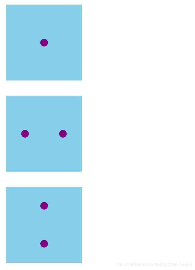
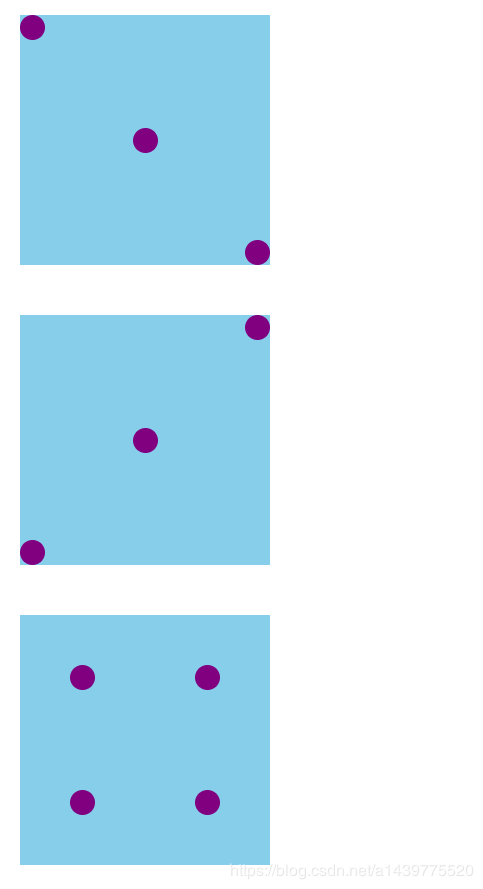
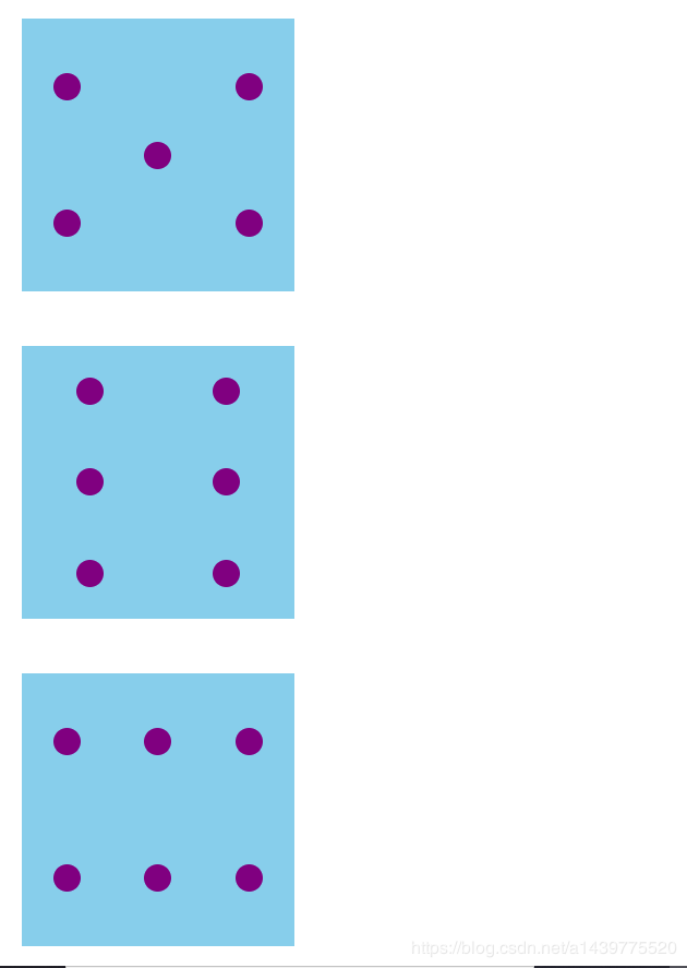
.big { width: 100px; height: 100px; background: skyblue; display: flex; margin-top: 20px; } .small { width: 10px; height: 10px; background: purple; border-radius: 5px; } .one { display: flex; justify-content: center; /*交叉轴*/ align-items: center; } .two { display: flex; justify-content: space-around; align-items: center; } .two2 { display: flex; flex-direction: column; justify-content: space-around; align-items: center; } .three { display: flex; flex-direction: column; justify-content: space-between; align-items: center; } .four { display: flex; justify-content: space-around; } .four1 { display: flex; justify-content: space-around; align-items: center; } .four2 { display: flex; flex-direction: column; justify-content: space-around; align-items: center; } .five { display: flex; justify-content: space-around; } .five1 { display: flex; flex-direction: column; justify-content: space-around; align-items: center; } .five2 { display: flex; flex-direction: row; align-self: center; } .six { display: flex; justify-content: space-around; } .six1 { display: flex; flex-direction: column; justify-content: space-around; align-items: center; } < div class = "big one" > < div class = "small" ></ div > </ div > < div class = "big two" > < div class = "small" ></ div > < div class = "small" ></ div > </ div > < div class = "big two2" > < div class = "small" ></ div > < div class = "small" ></ div > </ div > < div class = "big three" > < div class = "small" style = "align-self: flex-start" ></ div > < div class = "small" style = "align-self: center" ></ div > < div class = "small" style = "align-self: flex-end" ></ div > </ div > < div class = "big three" > < div class = "small" style = "align-self: flex-end" ></ div > < div class = "small" style = "align-self: center" ></ div > < div class = "small" style = "align-self: flex-start" ></ div > </ div > < div class = "big four" > < div class = "four2" > < div class = "small" ></ div > < div class = "small" ></ div > </ div > < div class = "four2" > < div class = "small" ></ div > < div class = "small" ></ div > </ div > </ div > < div class = "big five" > < div class = "five1" > < div class = "small" ></ div > < div class = "small" ></ div > </ div > < div class = "five2" > < div class = "small" ></ div > </ div > < div class = "five1" > < div class = "small" ></ div > < div class = "small" ></ div > </ div > </ div > < div class = "big six" > < div class = "six1" > < div class = "small" ></ div > < div class = "small" ></ div > < div class = "small" ></ div > </ div > < div class = "six1" > < div class = "small" ></ div > < div class = "small" ></ div > < div class = "small" ></ div > </ div > </ div > < div class = "big six" > < div class = "six1" > < div class = "small" ></ div > < div class = "small" ></ div > </ div > < div class = "six1" > < div class = "small" ></ div > < div class = "small" ></ div > </ div > < div class = "six1" > < div class = "small" ></ div > < div class = "small" ></ div > </ div > </ div > |
总结
到此这篇关于HTML使用栅格布局实现六种筛子的样式的代码详解的文章就介绍到这了,更多相关html 栅格布局 内容请搜索IT俱乐部以前的文章或继续浏览下面的相关文章,希望大家以后多多支持IT俱乐部!