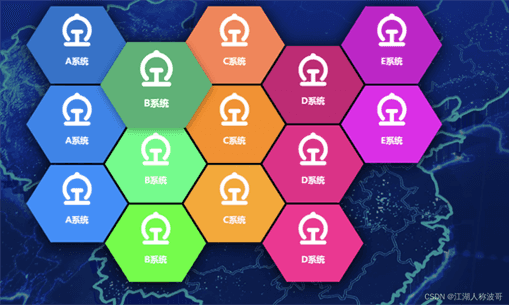
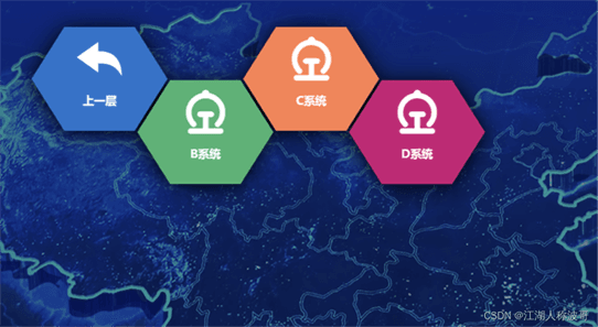
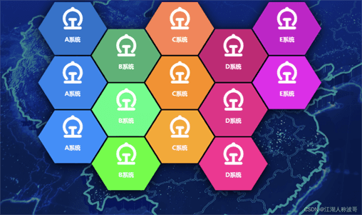
效果图
CSS样式
@keyframes _fade-in_mkmxd_1 {
    0% {
        filter: blur(20px);
        opacity: 0
    }
    to {
        filter: none;
        opacity: 1
    }
}
@keyframes _drop-in_mkmxd_1 {
    0% {
        transform: var(--transform) translateY(-100px) translateZ(400px)
    }
    to {
        transform: var(--transform)
    }
}
._examples_mkmxd_3 {
    margin-top:200px;
    position: relative;
    width:1000px;
    height: 640px;
    transition: transform .15s ease-out;
    filter: drop-shadow(0 4px 18px rgba(0,0,0,1));
    --grid-width: 140px;
    left: 50%;
    transform: translate(-50%, 0px);
}
._examples_mkmxd_3 div {
    position: relative;
    transition: filter .25s ease-out;
    animation: _fade-in_mkmxd_1 .35s cubic-bezier(.215,.61,.355,1) var(--delay) backwards;
}
._examples_mkmxd_3 div:hover {
    filter: drop-shadow(0 4px 8px rgba(0,0,0,.4));
    z-index: 3;
}
._examples_mkmxd_3 a {
    position: absolute;
    --transform: perspective(75em) rotateX(0deg) rotateZ(-0deg) translate(calc(var(--x) * 100%), calc(var(--y) * 86.67%)) scale(1.145);
    transform: var(--transform);
    animation: _drop-in_mkmxd_1 .35s cubic-bezier(.215,.61,.355,1) var(--delay) backwards;
    transition: transform .25s ease-out;
    /*clip-path: polygon(50% 100%,93.3% 75%,93.3% 25%,50% 0%,6.7% 25%,6.7% 75%);*/
    /*clip-path: polygon(25% 93.3%,75% 93.3%,93.3% 50%,75% 6.7%,25% 6.7%,6.7% 50%);*/
    clip-path: polygon(25% 87%,75% 87%,98.3% 50%,75% 13%,25% 13%,1.7% 50%);
}
._examples_mkmxd_3 a:hover{
    transform: var(--transform) translateZ(10px) scale(1.1);
}
._examples_mkmxd_3 img {
    aspect-ratio: 1;
    object-fit: cover;
    height: 64px;
    width: 64px;
    transform: translate(-50%, 40px);
    left: 50%;
    position: absolute;
    /*filter: drop-shadow(2px 2px 0px #00BFFF);*/
}
img {
    max-width: 100%;
    height: auto;
    display: block;
}
*{
    box-sizing: border-box;
}
.menu-box{
    display: block;
    width:200px;
    height:200px;
    /*background:rgba(84, 109, 231,.6);*/
    background: mediumpurple;
    position: relative;
}
.menu-text{
    color: #fff;
    position: absolute !important;
    top: 120px;
    left: 50%;
    font-weight: bold;
    transform: translate(-50%, 0px);
    /*filter: drop-shadow(2px 2px 0px #00BFFF);*/
    font-size: 16px;
    text-align: center;
}
.back-img{
    width: 64px !important;
    position: absolute;
    left: 50%;
    transform: translate(-50%, 20px);
    /*filter: drop-shadow(2px 2px 0px #00BFFF);*/
}
a:hover+.menu-box .menu-text{
    color: #00BFFF;
    filter: drop-shadow(2px 2px 0px #fff);
}
html
vue代码
new Vue({
    el:'#app',
    data(){
        return {
            menuData:[
                {
                    x:0,y:0,path:'https://observablehq.com/@d3/bar-chart/2?intent=fork',name:'A系统',img:'',children:[
                        {
                            x:0,y:0, path:'https://observablehq.com/@d3/bar-chart/2?intent=fork',name:'B系统',img:'',children:[
                                {
                                    x:0,y:0,path:'https://observablehq.com/@d3/bar-chart/2?intent=fork',name:'E系统',img:'',children:[]
                                },
                                {
                                    x:0,y:0,path:'https://observablehq.com/@d3/bar-chart/2?intent=fork',name:'A系统',img:'',children:[]
                                },
                            ]
                        },
                        {
                            x:0,y:0,path:'https://observablehq.com/@d3/bar-chart/2?intent=fork',name:'C系统',img:'',children:[]
                        },
                        {
                            x:0,y:0,path:'https://observablehq.com/@d3/bar-chart/2?intent=fork',name:'D系统',img:'',children:[]
                        },
                    ]
                },
                {
                    x:0,y:0, path:'https://observablehq.com/@d3/bar-chart/2?intent=fork',name:'B系统',img:'../img/navigation/火车站.png',children:[]
                },
                {
                    x:0,y:0,path:'https://observablehq.com/@d3/bar-chart/2?intent=fork',name:'C系统',img:'',children:[]
                },
                {
                    x:0,y:0,path:'https://observablehq.com/@d3/bar-chart/2?intent=fork',name:'D系统',img:'',children:[]
                },
                {
                    x:0,y:0,path:'https://observablehq.com/@d3/bar-chart/2?intent=fork',name:'E系统',img:'',children:[]
                },
                {
                    x:0,y:0,path:'https://observablehq.com/@d3/bar-chart/2?intent=fork',name:'A系统',img:'',children:[]
                },
                {
                    x:0,y:0, path:'https://observablehq.com/@d3/bar-chart/2?intent=fork',name:'B系统',img:'',children:[]
                },
                {
                    x:0,y:0,path:'https://observablehq.com/@d3/bar-chart/2?intent=fork',name:'C系统',img:'',children:[]
                },
                {
                    x:0,y:0,path:'https://observablehq.com/@d3/bar-chart/2?intent=fork',name:'D系统',img:'',children:[]
                },
            ],
            tempData:[],
            colors:[
                '#1874CD', '#3CB371', '#FF7F50', '#CD1076', '#CD00CD',
                '#1C86EE', '#00FF7F', '#FF8C00', '#EE1289', '#EE00EE',
                '#1E90FF', '#00FF00', '#FFA500', '#FF1493', '#FF00FF',
            ]
        }
    },
    watch:{
        menuData(){
            this.initCoor()
        }
    },
    mounted(){
        let _this = this
        this.getUser()
        // this.getMenuData()
        this.tempData = this.menuData
        this.initCoor()
        this.timer = setInterval(function(){
            _this.localDate = _this.dateFormat(new Date(),'yyyy-MM-dd hh:mm:ss')
        },1000)
    },
    destroyed(){
        clearInterval(this.timer)
    },
    methods:{
        menuEnter(item){
            if(item.name==='上一层')
                return
            this.msgData = item
            this.msgShow = true
        },
        menuLeave(item){
            this.msgShow = false
        },
        showTime(item){
            if(item.name==='上一层')
                return '0s'
            return Math.random()+'s'
        },
        menuClick(item,parant){
            let  arr =[]
            if(item.name==='上一层'){
                this.changeMenu(item.children)
            }else if(item.children.length>0){
                arr.push({x:0,y:0,path:'',name:'上一层',imgPath:'../img/navigation/icon-返回上一级.png',children:parant})
                item.children.forEach(t=>{
                    arr.push(t)
                })
                this.changeMenu(arr)
            }else{
                window.location.href = item.path
            }
        },
        changeMenu(data){
            let _this = this
            this.tempData = []
            setTimeout(function(){
                _this.tempData = data
                _this.initCoor()
            },10)
        },
        initCoor(){
            this.tempData.forEach((t,index)=>{
                t.color = this.colors[index]
                t.showTime = this.showTime(t)
                if(!t.children){
                    t.children = []
                }
                if(index4&&index9&&index
到此这篇关于html实现蜂窝菜单的示例代码的文章就介绍到这了,更多相关html蜂窝菜单内容请搜索IT俱乐部以前的文章或继续浏览下面的相关文章,希望大家以后多多支持IT俱乐部!

