一,展示效果
二,功能介绍
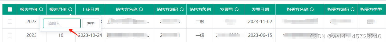
利用el-table组件提供的render-header属性自定义表头渲染内容,包含表头标题和一个搜索图标,图标是一个Popover组件弹出框,点击图标出现下面输入框和搜索按钮,点击搜索区域以外的位置,搜索区域消失,这个使用的是element-ui的 Clickoutside 指令。
三,实现代码
主页面 template 部分:
{{ row[item.prop] || "" }}
主页面 methods部分,其中SearchCom是自定义搜索组件。
    // 表头渲染函数
    NumberRenderHeader(createElement, { column, $index }, item) {
      let self = this;
      if (!item.isHeadSearch) {
        return item.label;
      }
      return createElement("div", [
        createElement("div", {
          domProps: {
            innerHTML: column.label,
          },
        }),
        createElement(SearchCom, {
          props: {
            defaultValue: "", // 默认值
            selectIndex: item.popIndex || $index - 3,
          },
          on: {
            selectChange: (val) => self.selectFruitChange(val, item),
          },
        }),
      ]);
    },
render-header属性:

关于
createElement函数:介绍链接
自定义组件部分
搜索// import Clickoutside from "element-ui/src/utils/clickoutside"; // 使用elementui的 Clickoutside 指令 import Clickoutside from "./clickoutside"; // 使用elementui的 Clickoutside 指令 export default { data() { return { value: "", // 输入框中的值 visible: false, // 组件显示隐藏控制 selectValue: "", // 当前选中值 popperElm: "", }; }, props: { defaultValue: { type: String, default: "", }, selectIndex: { type: Number, default: 0, }, }, mounted() { // 解决点击输入框组件关闭问题 this.popperElm = document.getElementsByClassName( "charge-item-header-popover" )[this.selectIndex - 1]; }, methods: { // 点击当前组件之外关闭 handleOutsideClick(e) { setTimeout(() => { this.visible = false; }, 16); }, // 展示当前组件时 鼠标光标定位到输入框 showPopover() { this.$nextTick(() => { this.$refs.sInput.focus(); }); }, // 关闭当前组件 closeOver() { this.visible = false; }, popClick(e) { this.visible = !this.visible; }, // 输入文字匹配对象的li项 confirm() { this.$emit("selectChange", this.selectValue); }, }, directives: { Clickoutside, // 引用elementui Clickoutside指令 }, }; .el-input { border-bottom: 1px solid #ccc; } .el-input--prefix /deep/ .el-input__prefix { left: 15px; } .popover_box { display: flex; align-items: center; padding: 0 5px; } ::v-deep .el-input { border-bottom: none; } .charge-item-header-popover { padding: 0; } .charge-item-header-popover .el-button { height: 80%; }
四,遇到的问题
点击表格的某个搜索图标,点击输入框,搜索区域消失,控制是否点击目标区域以外的元素是通过Clickoutside 指令实现的,下面是Clickoutside 指令的关键代码:
function createDocumentHandler(el, binding, vnode) {
  return function (mouseup = {}, mousedown = {}) {
    if (
      !vnode ||
      !vnode.context ||
      !mouseup.target ||
      !mousedown.target ||
      el.contains(mouseup.target) ||
      el.contains(mousedown.target) ||
      el === mouseup.target ||
      (vnode.context.popperElm &&
        (vnode.context.popperElm.contains(mouseup.target) ||
          vnode.context.popperElm.contains(mousedown.target)))
    )
      return;
    if (
      binding.expression &&
      el[ctx].methodName &&
      vnode.context[el[ctx].methodName]
    ) {
      vnode.context[el[ctx].methodName]();
    } else {
      el[ctx].bindingFn && el[ctx].bindingFn();
    }
  };
}
其中vnode代表使用自定义指令的元素,vnode.context.popperElm则代表使用自定义指令所在的vue文件中data属性中的数据,若这个值绑定的元素包含鼠标点击的元素(即搜索图标)则Popver弹出框不会消失,否则消失,其中popperElm绑定的元素如下:
  mounted() {
    // 解决点击输入框组件关闭问题
    this.popperElm = document.getElementsByClassName(
      "charge-item-header-popover"
    )[0];
  },
以上说明通过上面方法获取的弹出框元素并不包含搜索图标(两个元素不具有父子关系),但是从控制台检索元素看,两个元素又确实是包含关系,后来想到原因如下
一个表格内包含多个表头搜索字段,而第二个搜索框肯定是不包含第一个搜索框图标的
五,解决
在获取弹出框元素时传给搜索框组件一个索引说明是当前页面中的第几个弹出框
父组件页面
     createElement(SearchCom, {
         props: {
           defaultValue: "", // 默认值
           selectIndex: item.popIndex || 1, //selectIndex代表当前页面的第几个popper弹出框
         },
         on: {
           selectChange: (val) => self.selectFruitChange(val, item),
         },
       }),
自定义弹出框组件
 mounted() {
    // 解决点击输入框组件关闭问题
    this.popperElm = document.getElementsByClassName(
      "charge-item-header-popover"
    )[this.selectIndex - 1];
  },
到此这篇关于el-table组件实现表头搜索的文章就介绍到这了,更多相关el-table表头搜索内容请搜索IT俱乐部以前的文章或继续浏览下面的相关文章希望大家以后多多支持IT俱乐部!
一,展示效果
二,功能介绍
利用el-table组件提供的render-header属性自定义表头渲染内容,包含表头标题和一个搜索图标,图标是一个Popover组件弹出框,点击图标出现下面输入框和搜索按钮,点击搜索区域以外的位置,搜索区域消失,这个使用的是element-ui的 Clickoutside 指令。
三,实现代码
主页面 template 部分:
{{ row[item.prop] || "" }}
主页面 methods部分,其中SearchCom是自定义搜索组件。
    // 表头渲染函数
    NumberRenderHeader(createElement, { column, $index }, item) {
      let self = this;
      if (!item.isHeadSearch) {
        return item.label;
      }
      return createElement("div", [
        createElement("div", {
          domProps: {
            innerHTML: column.label,
          },
        }),
        createElement(SearchCom, {
          props: {
            defaultValue: "", // 默认值
            selectIndex: item.popIndex || $index - 3,
          },
          on: {
            selectChange: (val) => self.selectFruitChange(val, item),
          },
        }),
      ]);
    },
render-header属性:
关于
createElement函数:介绍链接
自定义组件部分
搜索// import Clickoutside from "element-ui/src/utils/clickoutside"; // 使用elementui的 Clickoutside 指令 import Clickoutside from "./clickoutside"; // 使用elementui的 Clickoutside 指令 export default { data() { return { value: "", // 输入框中的值 visible: false, // 组件显示隐藏控制 selectValue: "", // 当前选中值 popperElm: "", }; }, props: { defaultValue: { type: String, default: "", }, selectIndex: { type: Number, default: 0, }, }, mounted() { // 解决点击输入框组件关闭问题 this.popperElm = document.getElementsByClassName( "charge-item-header-popover" )[this.selectIndex - 1]; }, methods: { // 点击当前组件之外关闭 handleOutsideClick(e) { setTimeout(() => { this.visible = false; }, 16); }, // 展示当前组件时 鼠标光标定位到输入框 showPopover() { this.$nextTick(() => { this.$refs.sInput.focus(); }); }, // 关闭当前组件 closeOver() { this.visible = false; }, popClick(e) { this.visible = !this.visible; }, // 输入文字匹配对象的li项 confirm() { this.$emit("selectChange", this.selectValue); }, }, directives: { Clickoutside, // 引用elementui Clickoutside指令 }, }; .el-input { border-bottom: 1px solid #ccc; } .el-input--prefix /deep/ .el-input__prefix { left: 15px; } .popover_box { display: flex; align-items: center; padding: 0 5px; } ::v-deep .el-input { border-bottom: none; } .charge-item-header-popover { padding: 0; } .charge-item-header-popover .el-button { height: 80%; }
四,遇到的问题
点击表格的某个搜索图标,点击输入框,搜索区域消失,控制是否点击目标区域以外的元素是通过Clickoutside 指令实现的,下面是Clickoutside 指令的关键代码:
function createDocumentHandler(el, binding, vnode) {
  return function (mouseup = {}, mousedown = {}) {
    if (
      !vnode ||
      !vnode.context ||
      !mouseup.target ||
      !mousedown.target ||
      el.contains(mouseup.target) ||
      el.contains(mousedown.target) ||
      el === mouseup.target ||
      (vnode.context.popperElm &&
        (vnode.context.popperElm.contains(mouseup.target) ||
          vnode.context.popperElm.contains(mousedown.target)))
    )
      return;
    if (
      binding.expression &&
      el[ctx].methodName &&
      vnode.context[el[ctx].methodName]
    ) {
      vnode.context[el[ctx].methodName]();
    } else {
      el[ctx].bindingFn && el[ctx].bindingFn();
    }
  };
}
其中vnode代表使用自定义指令的元素,vnode.context.popperElm则代表使用自定义指令所在的vue文件中data属性中的数据,若这个值绑定的元素包含鼠标点击的元素(即搜索图标)则Popver弹出框不会消失,否则消失,其中popperElm绑定的元素如下:
  mounted() {
    // 解决点击输入框组件关闭问题
    this.popperElm = document.getElementsByClassName(
      "charge-item-header-popover"
    )[0];
  },
以上说明通过上面方法获取的弹出框元素并不包含搜索图标(两个元素不具有父子关系),但是从控制台检索元素看,两个元素又确实是包含关系,后来想到原因如下
一个表格内包含多个表头搜索字段,而第二个搜索框肯定是不包含第一个搜索框图标的
五,解决
在获取弹出框元素时传给搜索框组件一个索引说明是当前页面中的第几个弹出框
父组件页面
     createElement(SearchCom, {
         props: {
           defaultValue: "", // 默认值
           selectIndex: item.popIndex || 1, //selectIndex代表当前页面的第几个popper弹出框
         },
         on: {
           selectChange: (val) => self.selectFruitChange(val, item),
         },
       }),
自定义弹出框组件
 mounted() {
    // 解决点击输入框组件关闭问题
    this.popperElm = document.getElementsByClassName(
      "charge-item-header-popover"
    )[this.selectIndex - 1];
  },
到此这篇关于el-table组件实现表头搜索的文章就介绍到这了,更多相关el-table表头搜索内容请搜索IT俱乐部以前的文章或继续浏览下面的相关文章希望大家以后多多支持IT俱乐部!

