Box-shadow属性是css效果非常实用的修饰效果,可以在很多地方见到它的影子。
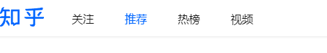
知乎中的Box-shadow

百度中的Box-shadow
所以,来详细看一下Box-shadow的参数:
box-shadow:(inset)2px 2px 5px #000;
其中有六个参数,分别为
inset:内阴影/外阴影,
2px 2px (阴影偏移位置),
5px(阴影模糊程度),
5px(阴影长度扩展),
#000(颜色)
接下来看一些常用的实例:

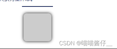
阴影位置向right和bottom偏移了2px,使其获得立体感。
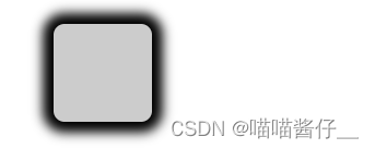
阴影位置不进行偏移,模糊范围10px。
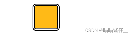
还可以在模糊范围后加上一个像素值,用来表示阴影扩展长度的 值:
扩展长度值为正;

扩展长度值为负,可以用来模拟展示效果。
我们还可以用多组阴影属性来模拟动漫效果:
三重阴影,制造动漫描边效果。
使用伪元素创造阴影效果,可以实现非常逼真的真实感:

.box {  margin:10px auto;
	width: 180px;
	height: 90px;
	background: #ccc;
	border-radius: 10px;
}
.shadow {
	position: relative;
	max-width: 270px;
	box-shadow: 0px 1px 4px rgba(0,0,0,0.3),
	0px 0px 20px rgba(0,0,0,0.1) inset;
}
.shadow::before,
.shadow::after {
   content:"";
   position:absolute;
   z-index:-1;
}
.shadow::before,
.shadow::after {
   content:"";
   position:absolute;
   z-index:-1;
   bottom:15px;
   left:10px;
   width:50%;
   height:20%;
}
.shadow::before,
.shadow::after {
   content:"";
   position:absolute;
   z-index:-1;
   bottom:15px;
   left:10px;
   width:50%;
   height:20%;
   box-shadow:0 15px 10px rgba(0, 0, 0, 0.7);
   transform:rotate(-4deg);
}
.shadow::after{
   right:10px;
   left:auto;
   transform:rotate(3deg);
 }
到此这篇关于css阴影详解之Box-shadow修饰性属性详解的文章就介绍到这了,更多相关css Box-shadow修饰性属性内容请搜索IT俱乐部以前的文章或继续浏览下面的相关文章,希望大家以后多多支持IT俱乐部!

