从QQtabBar看BEM
首先BEM是什么意思?
BEM的意思就是块(block)、元素(element)、修饰符(modifier),是由Yandex团队提出的一种前端命名方法论,是一种 CSS命名规范
weui-primary_loading__dot:库名-组件_状态__元素名
库名:一般是各公司约定俗成的。
组件:一般用来创建单独的css来修饰特定的标签。
状态:一般以标签处于的状态或者可以进行交互的效果命名
元素名:一般以标签作用描述命名。
BEM的优点:
易用性 如果想使用BEM,你只需要采用BEM命名规范即可单元性 独立的块和CSS选择器,可以使得你的代码可重用和单元化灵活性 使用BEM之后,方法和工具可以按照你喜欢的方式去组织和配置
详细介绍一下BEM
B(Block):块
块(Block):可重复使用的功能独立的页面组件
块名称描述了它的目的(“它是什么?” 功能库或者组件),而不是它的状态(红色或者大小)
- 块不应影响其环境,这意味着您不应为块设置外部几何(边缘)或定位。
- 使用 BEM 时,也不应使用 CSS 标签或ID选择器
E(element):元素
元素(ELement):块的复合部分。元素是依赖上下文的:它们只有处于他们应该属于的块的上下文中时才是有意义的,所以不能单独使用。
元素名称描述它的用途(“这是什么?”items、text等),而不是它的状态(“它是什么类型,或者看起来像什么?”红色、大的等等)。
M(modifier):修饰符
定义方块或元素的外观、状态或行为的实体
描述了它的外观(“什么尺寸?” 或”哪个主题?等等)
了解了BEM后我们就需要思考一下,我们应该怎样使用
- 创建块:如果代码的一部分可能重复使用,并且它不依赖于正在实施的其他页面组件。
- 创建元素:在代码中起到作用描述下,在你所创建的块下使用。
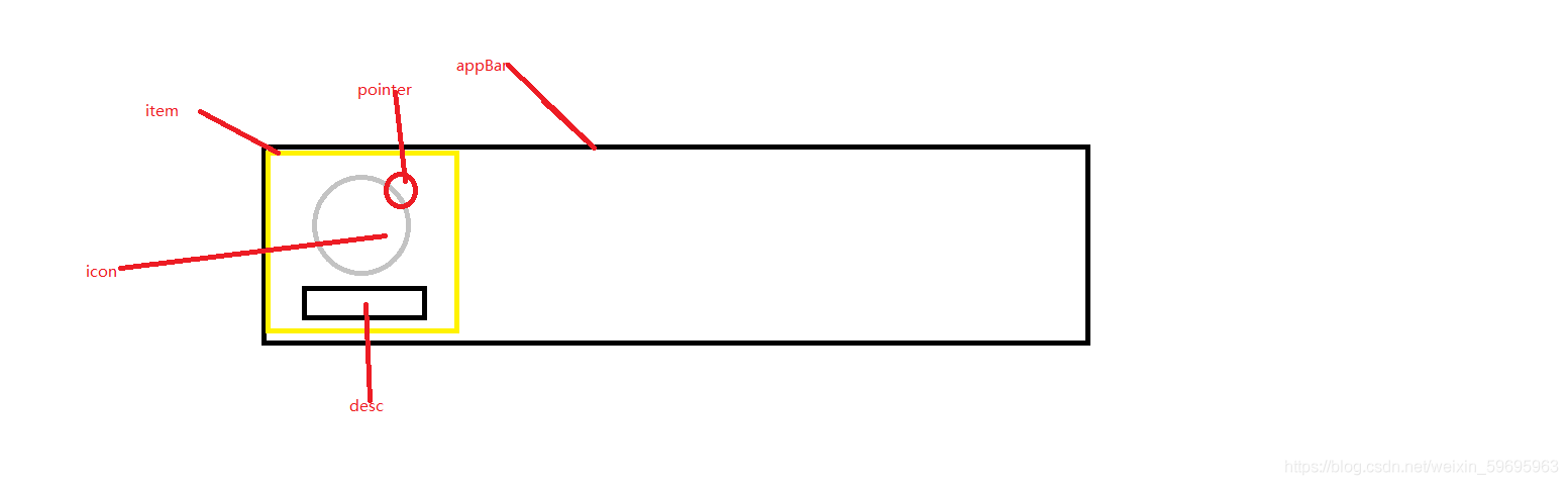
- 创建修饰符:当你需要修饰元素的特性时。 分析一下qq应用栏结构
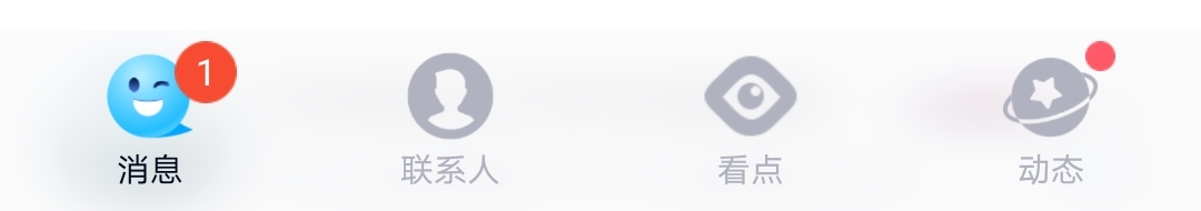
整体来看,他是一个大块包含4个小块,每个小块里包含三个元素。
块 appBar
小块 item
图标 icon
标签 desc
小圆点 pointer
* {
            padding: 0;
            margin: 0;
        }

        a:link {
            color: #b0b3bf;
        }

        a:vistied {
            color: #b0b3bf;
        }

        a:hover {
            color: #2ec4fc;
        }

        a:active {
            color: #2ec4fc;
        }
        a i.iconfont {
            display: inline-block;

            width: 36px;
            height: 36px;
            overflow: hidden;
            margin-bottom: 3.5px;
            font-size: 36px;
        }
        a i.icon_on{
            color: #2ec4fc;
        }


        .qqui-appBar {
            display: flex;
            position: absolute;
            bottom: 0;
            width: 100%;
            z-index: 500;
            background-color: #f9f9f9;
        }

        .qqui-appBar .qqui-appBar__item {
            flex: 1;
            text-align: center;

            padding-top: 25px;
            font-size: 0;
            color: #b0b3bf;
            text-decoration: none;
        }
        .qqui-appBar__item>span{
            display: inline-block;
            position: relative;
            margin-bottom: 9px;
        }
        .qqui-appBar .qqui__desc {
            font-size: 18px;
            text-align: center;
            line-height: 18px;
            margin-bottom: 13px;
        }
        .qqui-appBar .qqui__desc_on{
            color: black;
        }

        .qqui-appBar .qqui__pointer{
            position: absolute;
            top: -2px;
            right: -2px;
            width: 20px;
            height:20px;
            display: inline-block;
            line-height: 18px;
            color: white;
            border-radius: 50%;
            font-size: 10px;
        }
        .qqui-appBar .qqui__pointer_on{

            background-color: #F43539;
        }
        .qqui-appBar .qqui__pointer_oOn{
            width: 12px;
            height: 12px;
            line-height: 12px;
            background-color: #F43539;

        }
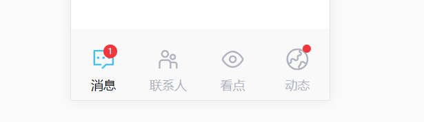
最后的效果图
上图图标皆来自阿里图标库: https://www.iconfont.cn/collections/detail?spm=a313x.7781069.1998910419.d9df05512&cid=16472
使用方式为下载方法,从上面网址下载。然后将其以css引入,使用类名进行添加。
到此这篇关于从QQtabBar看css命名规范BEM的详细介绍的文章就介绍到这了,更多相关css命名规范BEM内容请搜索IT俱乐部以前的文章或继续浏览下面的相关文章,希望大家以后多多支持IT俱乐部!

